Articles/Essays – Volume 56, No. 4
Correlating Orthodoxy and Style: Institutionally “Approved” Christ-Centered Art in LDS Visual Resources and Meetinghouses, 1990–2021
Religious images have long been used in Latter-day Saint worship and instruction. Paintings, illustrations, and graphic works served a devotional function among the early Church members. Not only did the Latter-day Saints in Nauvoo use images to memorialize the Church’s founding story, but they frequently placed images in their places of worship to remind them to maintain reverential focus on New Testament themes and the life of Jesus Christ. From the time the first settlers in Utah built permanent meetinghouses, they decorated the spaces with images that focused their thoughts on the Church’s gospel.[1]
Meetinghouses were decorated with scripture-themed paintings by local artists, which were often large, framed works, murals, and relief. It was not uncommon to see framed portraits of Church leaders hanging near the rostrum. For example, the Salt Lake Fourteenth Ward chapel featured portraits of Brigham Young and local authorities over the rostrum, so that ward members could easily see their priesthood leadership (see fig. 1). Framed portraits of local leaders were hung near the choir apse in the Brigham City Third Ward chapel (fig. 2). Paintings of the life of Christ could be seen above the choir loft of the Provo Tabernacle. A painting of Joseph Smith receiving the gold plates by C. C. A. Christensen was hung in the Ephraim Tabernacle. Another version of Smith receiving the gold plates from Moroni by Lewis A. Ramsey was hung in the Salt Lake Eleventh Ward chapel. Numerous Salt Lake City ward buildings featured intricately designed stained-glass windows featuring events in the restoration of the Church and New Testament narrative scenes (fig. 3).[2]
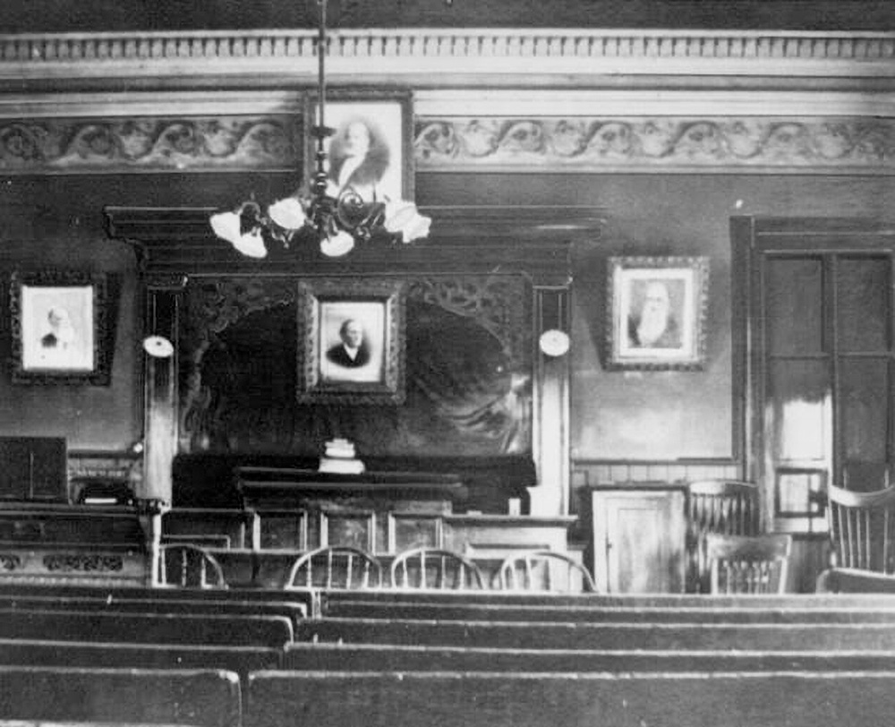
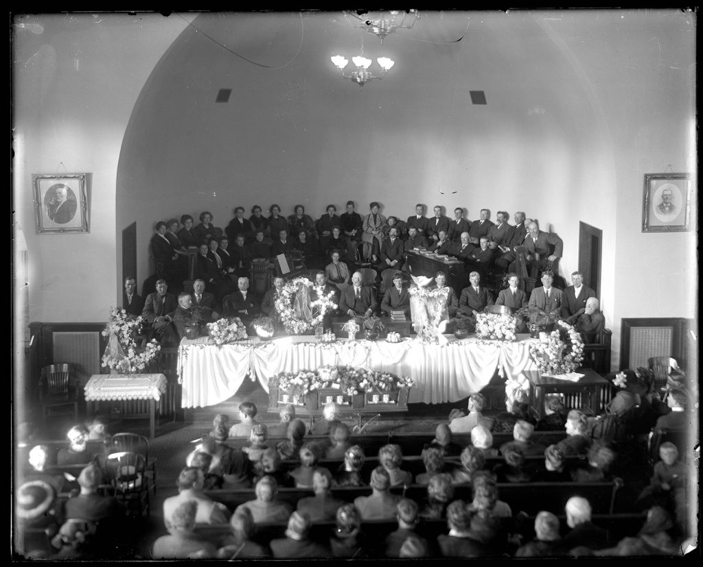
Figure 2. Interior of Brigham City Third Ward chapel during a funeral service. Note the framed portraits of Church leaders flanking the rostrum. Image courtesy of Special Collections and Archives, Utah State University.
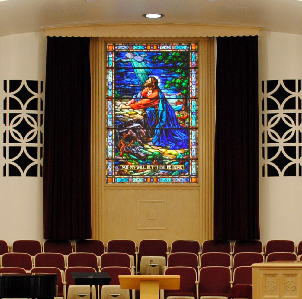
Figure 3. Stained-glass window, featuring Christ in Gethsemane after Heinrich Hofmann in the Bonneville Ward chapel in Salt Lake City. Photo courtesy of ldsarchitecture.wordpress.com.
Latter-day Saint leaders and members of congregations followed an early- to mid-twentieth-century trend in Protestant meetinghouse interior decoration by adorning or beautifying their ward buildings with biblical and Book of Mormon–themed artwork. Paintings of Christ and New Testament narratives were frequently hung in halls, foyers, and even chapels of ward meetinghouses. During that period, murals and framed artwork were thought to enhance worship and promote a sense of reverence and sacred space (figs. 4 and 5). This practice continued well into the twentieth century, when member artists were contributing their work to decorate local church buildings and temples.[3]
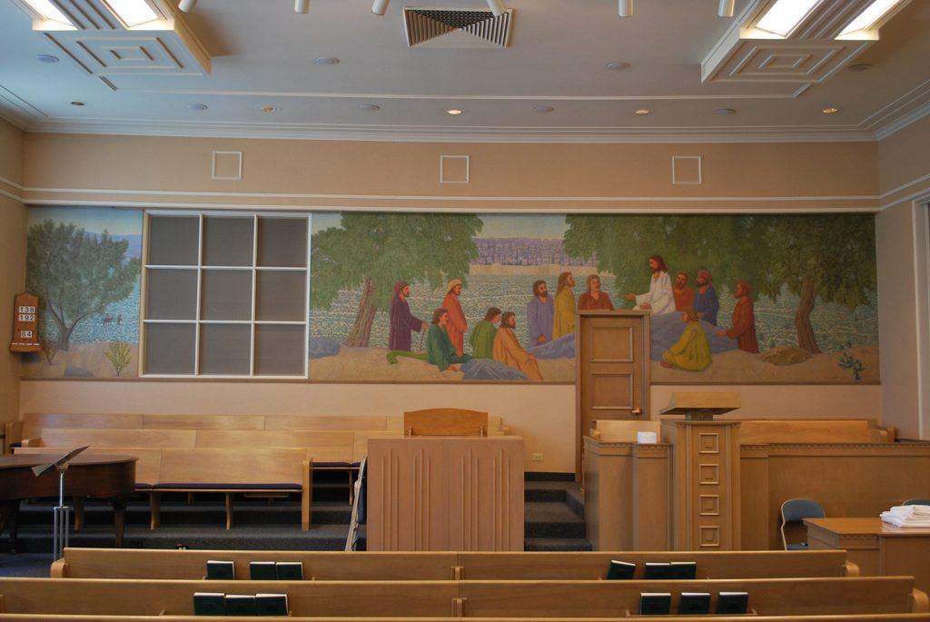
Figure 4. Mural of Christ teaching his disciples outside of Jerusalem by LeConte Stewart. Interior of the Hudson Ward chapel, Denver, Colorado. Photo courtesy of Cliff Young.
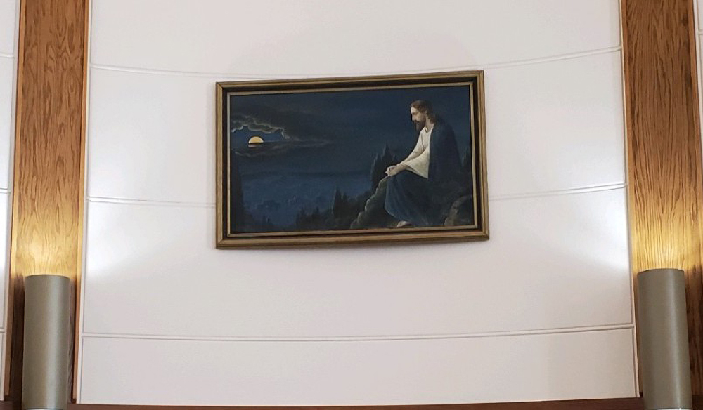
Figure 5. Framed painting of Christ on the Mount of Olives by Effie M. Carmack after Giovanni, hanging over the choir loft in the LDS meetinghouse in downtown St. Johns, Arizona. Photo courtesy of Jayne Pulsipher.
In 1939, Professor B. F. Larsen, head of the Department of Art at Brigham Young University, reiterated that good art was an essential part of meaningful worship. “Pictures are focal points for attention,” he wrote. “Their value in mass concentration is well understood. A group of people, gazing at a fine picture, will forget hate and envy. In proportion as they are united in understanding and appreciation they will become brothers and advocates of peace and goodwill.”[4] According to Larsen, harmonious design can have a positive effect on our thoughts, moods, and attitudes. “Pictures in churches should be worthy in subject matter and in art quality. Their selection requires understanding and careful thinking.”[5] A beautiful pastoral scene or arid desertscape, as shown in many early Latter-day Saint temples, might turn the thoughts of a participant toward the biblical creation story, the placement of Adam and Eve in the earthly garden, and their eventual banishment into the wilderness. A well-rendered painting of Christ or events in his ministry would, naturally, turn our thoughts to him as well.[6]
Both members and administrators in the early decades of the Church clearly valued the motivating power of images in worship. Religious images began to be used more prominently in both sacred spaces and official publications. Their potential as a mechanism for influencing—and even stimulating—the piety of Church members was recognized but not yet harnessed or systematized to optimize their impact. Artistic imagery was used illustratively in religious teaching, but the notion that Christ—the central focus of the Church’s message—would be the defining figure of the Church’s visual culture and image-making was not yet realized.
Although historians and sociologists of the late twentieth century acknowledged that visual culture is an important component of the Church’s efforts to shape its image, they did not focus any real attention on characterizing the official artwork and graphic designs used to represent its print and digital presence.[7] Scholars of Mormon image-making during that period had not yet addressed the fact that the Church’s Christ-centered visual culture fit into an overall plan to orchestrate the Church’s public image, beginning with measures to centralize the production and selection of official publications and accompanying illustrations.[8]
This study builds on an earlier analysis of mine, an article published by BYU Studies in 2000, that discussed images of Christ and the Church’s correlation efforts to curate a body of “approved” Christ-centered images for use in official Church publications and materials.[9] In the more than two decades since my study, the Church has incrementally implemented measures to extend its influence over the selection and use of Christ-centered art in printed publications, digital media, and meetinghouses. Despite numerous independent organizations offering member artists opportunities to render their Christ-centered imagery with modern approaches and in diverse ways, official artwork vetted by institutional authority continues to be used to uphold an orthodoxy of style and doctrine.
Correlating a Visual Archetype
Church leaders began to systematize missionary programs and lesson materials in 1960 through the Priesthood Correlation Program.[10] Correlation, being a system of evaluation or vetting of information and accompanying graphics, was a way to ensure accuracy, orthodoxy, and cohesion of official Church products. As a result, artwork, audiovisual resources, and publications were created by a corps of graphics and media specialists working under the direction of Correlation officials. Following the death of Correlation Committee member Richard L. Evans, the First Presidency called J. Thomas Fyans to serve as managing director of the Internal Communications Department. He was instructed to “ensure that all such materials are correlated, that they are of high quality and that they conform to Church policy, doctrine and standard.”[11] Serving under Fyans, Daniel H. Ludlow was appointed director of instructional materials and was charged with overseeing “curriculum, planning, correlation, edition, and graphic designs.”[12]
Within the purview of Correlation, instructors were encouraged to use the Church-approved pictures uniformly issued in teacher training materials or meetinghouse libraries. These pictures were commercially produced images by private presses such as Wheelwright Lithography Company, Providence Lithograph Company, and Standard Publishing Company. The pictures were used to supplement lessons on Christ’s ministry and other Bible stories and were made available as what was then called the CTR Pilot Picture Set, the Guide Patrol Teaching Aids, and the Top Pilot Picture series. These didactic images featured the illustrative work of non-Mormon artists such as Harold Copping, Griffith Foxley, Karl Godwin, H. Willard Ortlip, and Elsie Anna Wood.[13]
When the Correlation effort began, Latter-day Saints had a growing number of skilled artists and illustrators to interpret the Church’s unique history and gospel themes. Church officials, however, decided to turn to professional artists outside of the faith to create correlatively directed artwork. In the 1960s, Seventh-day Adventist artist Harry Anderson and two other non-Latter-day Saint artists, Tom Lovell and Kenneth Riley, were commissioned to create illustrations depicting Church history and scriptural themes. Anderson’s paintings on the life of Christ grew to be some of the most recognizable and popular images in the Church. Several of his paintings of Christ are, perhaps, the most widely used in the Church today (fig. 6).[14] Of this, Mormon studies scholar Terryl Givens commented, “any institution with the LDS church’s sense of mission, theological certainty, and impulse toward centralized administration and doctrinal standardization is bound to prefer orthodox illustration to creative expression in the art it commissions.”[15]
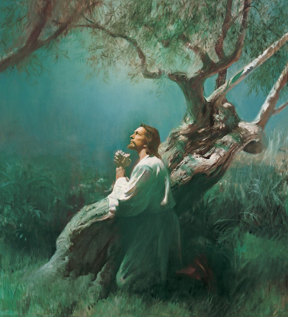
Under increased standardization, official publications were changed to meet the needs of a growing Church. In 1971, Doyle L. Green became director of magazines and was charged with overseeing the production and distribution of newly created magazines the New Era, Ensign, and Friend, along with the Unified Magazines, the international magazines published by the Church in Danish, Dutch, Finnish, French, German, Norwegian, Spanish, and Swedish.[16] These colorful, slick magazines were created to replace the long-standing Improvement Era and Instructor magazines and featured religious masterworks, illustrations, and photographs for cover art and graphics to accompany the texts.[17]
In the 1980s and 1990s, Latter-day Saints placed a greater emphasis on the doctrine of atonement by avoiding melancholic images of the crucifixion and more often representing images of the Church’s doctrines regarding the Creation and Christ’s resurrection, ascension, and visitation to the Americas. In contrast to the Catholic and Protestant focus on the symbolism of the cross, LDS renderings of Christ tended to avoid the imagery of Calvary and instead drew the viewer into a path of spiritual rectitude modeled, as much as artistically possible, in the image of a living Christ. A recent study by three thoughtfully engaged scholars, John Hilton III, Anthony Sweat, and Josh Stratford, examined the notion that—as I asserted in my 2000 study—images of Christ that depicted his suffering in Gethsemane appeared more frequently in Church publications as a reflection of Church’s emphasis of this step in the Atonement. Their study further documents this trend (that extended into the 2000s and 2010s) of favoring images of Christ’s suffering in Gethsemane over those depicting his death on the cross and the motivations behind it.[18]
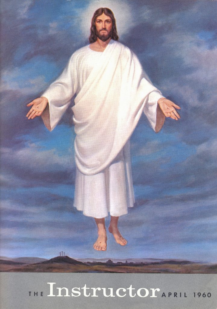
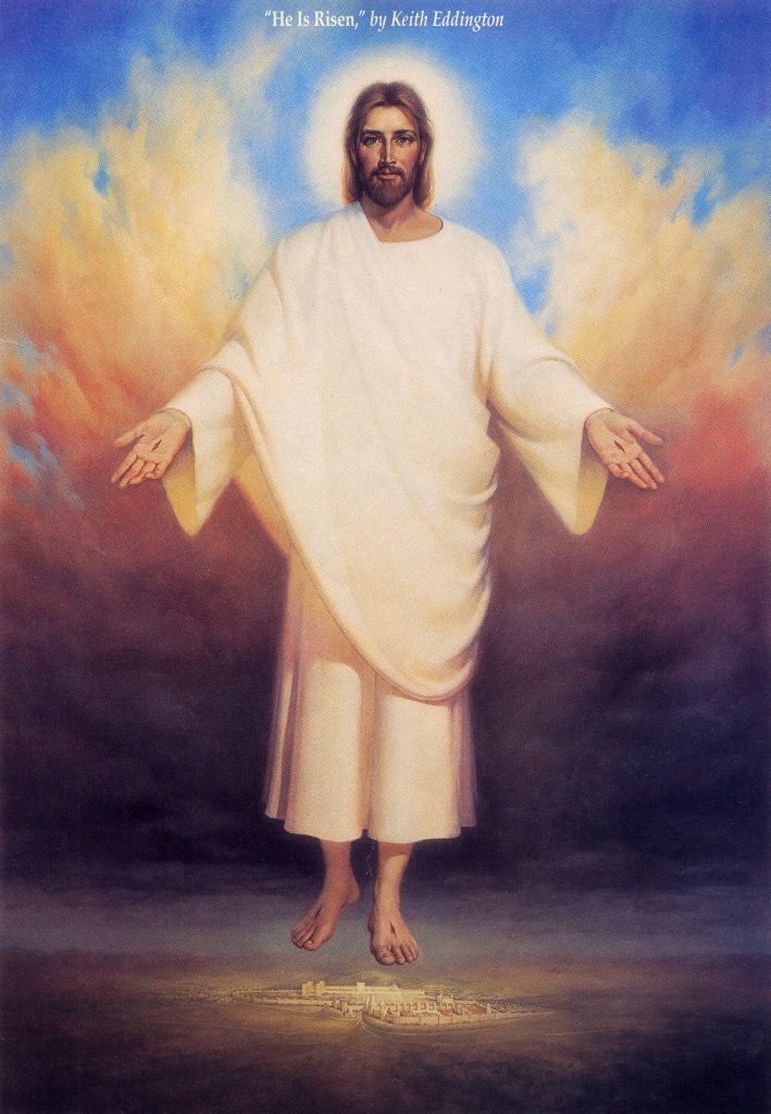
An example I shared in my BYU Studies article was directly commissioned by President Gordon B. Hinckley. President Hinckley asked Salt Lake City–based artist E. Keith Eddington to do a new version of his painting The Ascension of Christ (1960), which had been used for Church publications and tracts (fig. 7). Hinckley had seen the original image hanging in a Detroit stake center during a visit and was so impressed with the painting that he asked Eddington to paint the large nine-feet high and six-and-a-half-feet wide version now hanging on the north wall of the Legacy Theater in the Joseph Smith Memorial Building.[19]
Eddington’s original painting included design elements that have been visibly removed in the new version. The Ascension of Christ included the hill of Calvary and crosses on the horizon; in the 1994 version, titled He Is Risen, the Calvary crosses were removed. His use of dark, drab blues and grays in the original allude to the Crucifixion, in contrast to the warm fiery colors of the newer painting, which emphasize the triumph of Christ overcoming death—a more potent event according to Latter-day Saint belief (fig. 8).
Approved Images in a Digital Age
Establishing a visual archetype—a set of expected physical attributes and depicted activities—the Church could maintain cohesion and orthodoxy in its Christ-centered imagery while shaping its worldwide presence as a distinctive Christian denomination. In much the same way that an institution “controls the exegetical activities of its members” by issuing official policies and manuals, it would regulate the access and use of officially approved Christ-centered media by its members and journalists reporting on the Church.[20] Through the Church’s correlation committees, priesthood leaders set the boundaries of religious orthodoxy in its media depicting Christ. A relatively small selection of correlated images could be easily reviewed, assessed, and updated to best shape its visual identity.[21]
Shortly after the Church launched its first website in December 1996, Frank McEntire, a widely respected artist, curator, writer, and arts administrator in Utah, wrote a special op-ed on images of Christ for the Salt Lake Tribune in which he characterized depictions of Christ by several religions—including the Baptist, Catholic, Greek Orthodox, and LDS Churches—in Salt Lake City and their importance among those faiths.[22] Citing historian Colleen McDannell’s relatively passing observation about Del Parson’s red-robed Jesus—widely used and highly recognizable in the LDS Church—McEntire’s comment on the LDS visuals of Christ stressed the impact that Parson’s iconic portrait of Christ had on the piety of Church members.[23] The painting, he wrote, “appeared last week for the first time in cyberspace. Worldwide visitors to the LDS Church’s Internet address (www.lds.org) are introduced to this portrayal of Jesus (and a new Church logo), moving the image from ‘in-house’ curriculum use to a public stage. This depiction of Christ has the potential to become at least as renowned as Warner Sallman’s familiar ‘Head of Christ’ popularized throughout Christianity after World War II”[24] (fig. 9).
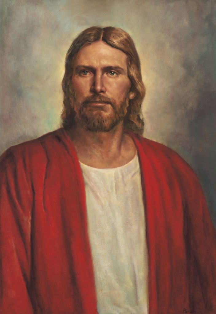
Figure 9. Jesus the Christ by Del Parson. Copyright by Intellectual Reserve.
McEntire’s insightful op-ed seemed to precipitate a heighted awareness among Church leaders of the importance of Christ-centered artwork in conveying the Church’s public image. In April 1998, the Curriculum Department, in response to an assignment by the Priesthood Executive Council (PEC), individually assessed 349 images of Christ owned by the Church or whose copyright had been secured for Church publications. The department assessment was performed by Church officials Dallin H. Oaks, Jeffrey R. Holland, Robert D. Hales, Jack H. Goaslind, Jay E. Jensen, and John M. Madsen, using a three-tiered classification of usability. This three-tiered ranking system was as follows: (1) Use where appropriate, (2) Use caution: Review application, size, and cropping, and (3) Do not use.[25]
The members of the committee examined and marked each image with a number and an occasional comment in the lower margin. While they cannot serve as precise measurements of appraisal, these marks reveal the authoritative influence Church correlation has on the Latter-day Saint visual perception of Christ. Their assessments of each image are illuminating indicators of the kinds of physiognomic traits they want members to recognize and others that they want excluded from visual representations of Christ in official Church publications.[26]
Evaluative assessments of the images seemed to be based on personal criteria but were generally regarding the overall appearance of the subject, its scriptural accuracy, and the manliness of Christ. For example, images produced by non-LDS artists such as Gustave Doré, Alexandre Bida, William Henry Margetson, and James Tissot consistently received the second and third classification, while images by LDS artists such as Robert T. Barrett, Del Parson, Greg Olsen, and Gary Kapp regularly received the number one ranking.[27] William Henry Margetson’s painting Mary Anoints Jesus’ Feet was given twos and threes with a comment that Christ appeared “too effeminate” (fig. 10).[28] James Tissot’s A Woman Anointeth the Feet of Jesus (1899; fig. 11) also received a “to[o] effeminate” comment and an observation that the apostles were “strange looking!”[29] Two threes and a two were given to C. Bosseron Chambers’s portrait of Christ due to an apparent objection to the “split beard and angry eyes” (fig. 12).[30] Carl Bloch’s painting Christ in Gethsemane (1873) was rated with twos and threes, but one committee member advised cropping “and retouching of wings,” while another committee member wrote: “Angel looks female.”[31] Gustave Doré’s Jesus Praying in Garden was also rated with two threes and a two, but one committee member wrote: “Was He within sight of the apostles as he prayed? Don’t like that much” (fig. 13). James Tissot’s painting The Chief Priests Ask Jesus by What Right Does He Act in This Way (1886–1894), received twos and threes with mixed comments. One reviewer wrote that the “Savior’s face [is] lacking,” while another wrote that the “Priests are good” (fig. 14).[32]
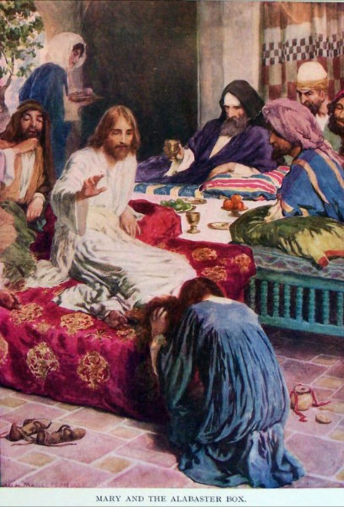
Figure 10. Mary and the Alabaster Box by William Henry Margetson. From the Bible Picture Book, published by Thomas Nelson and Sons, ca. 1945.
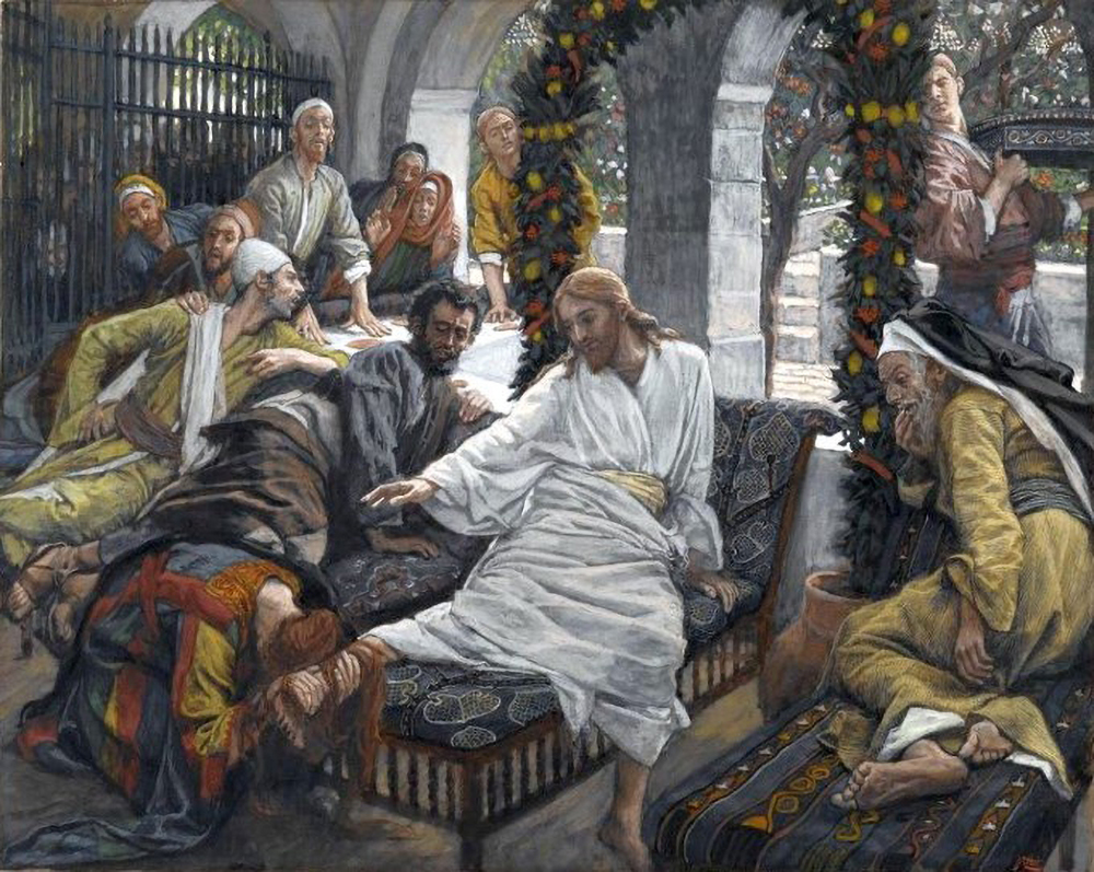
Figure 11. The Ointment of the Magdalene (Le perfume de Madeleine) by James Tissot. Opaque watercolor over graphite on gray wove paper, 1886–1894. Courtesy of the Brooklyn Museum.
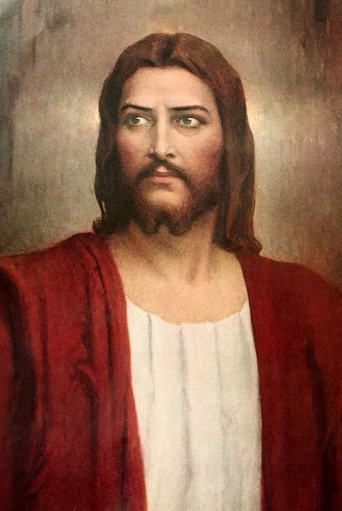
Figure 12. Portrait of Christ by C. Bosseron Chambers. Image courtesy of the author.
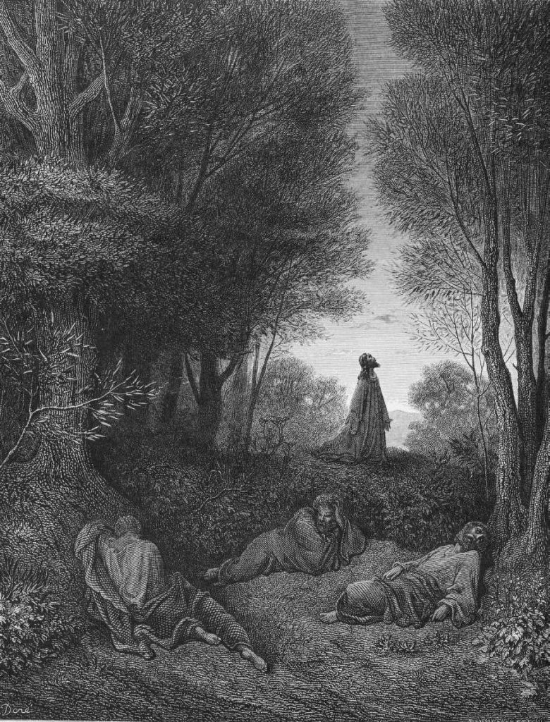
Figure 13. Jesus Praying in the Garden by Gustav Doré, ca. 1880. Public domain.
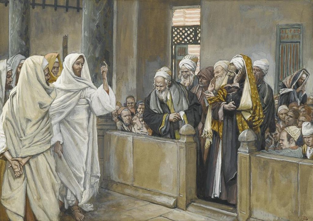
Figure 14. The Chief Priests Ask Jesus by What Right Does He Act in This Way (Les princes des prêtres interrogent Jésus de qual droit il agin) by James Tissot. Opaque watercolor over graphite on gray wove paper, 1886–1894. Courtesy of the Brooklyn Museum.
During the image assessment by the committee, Ronald Knighton, managing director of the Curriculum Department, informed graphics editor Allan Loyborg that the “PEC decided to have a few more visuals added. Some that may not be as strong such as the Keith Eddington one are needed.” He then asked Loyborg to check the offices of members of the First Presidency and the Quorum of the Twelve to be sure that all of these artworks were included in the survey and to secure copyright for them if it hadn’t already been done. It was important that the Curriculum Department receive counsel on what should be used, how often it should be used with scriptures and in Church publications, and whether more new portraits Christ should be commissioned.[33]
Much like the selection of images for official Church publications, a general concern for wholesomeness and accuracy dictated the use of images of Christ in meetinghouses. Although it was not specific in the types or quality of images that should be used, the 1999 General Handbook of Instructions was clear that images should be obtained from pre-approved sources. The policy on artwork read:
Artwork in Church buildings should be of high quality and depict subjects that are appropriate in a house of worship. It also should be properly framed. Church-approved pictures can be obtained through the Purchasing Division or from Church distribution centers (see the Meetinghouse Artwork Brochure). Pictures and other artwork may be placed in appropriate locations in the meetinghouse. However, they may not be placed in the chapel or near the baptismal font. Statues, murals, or mosaics are not authorized. This policy does not apply to works of art that have been on display for many years in the chapels of existing meetinghouses. If artwork of poor quality is offered, local leaders should tactfully decline accepting it for display in meetinghouses.[34]
This policy on the quality of selected of artwork did not vary for over a decade following the issuance of the 1999 handbook, although the catalog or pool of approved images would develop over time with the advent of the internet and digital technology.[35]
On May 24, 1999, nearly simultaneous to the release of an update to the existing Meetinghouse Artwork brochure and new physical facilities guidelines, the Church launched its new FamilySearch.org website—a genealogical records search portal—which overwhelmingly boosted the Church’s official digital presence in cyberspace. That same year, the LDS.org website augmented its digital imagery and text with an audio broadcast of the October general conference.[36] This end-of-the-century development in the Church’s methods of delivering both its gospel message and institutional policies was uncertain but inevitable. The possibilities for transmitting digital images and video, as well as text, were both promising and limitless.[37] The use of approved graphics and artwork to support the web text (institutional rhetoric) would legitimize the web presence with authority, or—in branding terminology—authenticity. But the graphics and artwork would have to be of high quality, appropriate for the situation, perceived as uniquely institutional, and regularly improved.[38]
The rise of the internet gave the Church exciting new avenues for presenting its gospel message and conveying a cohesive identity. However, the notion of obsolescence—or the constant need to update and improve outdated information and visuals—motivated an effort to centralize the oversight of the Church’s web presence. On March 15, 2001, the First Presidency issued a letter expressing a desire for correlative oversight of the Church’s official websites. “As you know, the Church has developed several Church Internet sites,” the letter began. “These sites contain approved, correlated material that the Church has deemed appropriate for the Internet. New and updated material will continue to appear on these sites. As the Church grows, it is very important that information presented to the world be accurate and dignified and that it represent a single, unified Church voice.”[39]
As numerous websites for local congregations began to be created with little or no guidance and control over content, the risk of violating copyright and privacy laws became as much a concern as accuracy and cohesion. “In addition, it is imperative that the rights of third parties be protected and respected through strict compliance with applicable laws,” the letter explained. “With this in mind, a policy for the creation, operation and maintenance of local unit Web sites is being developed and will be sent to priesthood leaders. Until the policy is established, the First Presidency had requested that local church units and organizations should not create or sponsor Web sites. They have also determined that existing sites should be discontinued.”[40]
Using the 1998 Priesthood Executive Council image survey results, along with the recently implemented web policy, the Curriculum Department initiated a noticeable move toward approved Christ-centered art. The turn of the twentieth century signaled an effort to inspire the creation and use of new and uniquely Latter-day Saint depictions of Christ. A December 2002 New Era article entitled “Images of Christ” featured ten widely known and respected member artists who spent their careers painting the likeness of Christ on commission for the Church. The ten included: Robert Barrett, Simon Dewey, Gary Kapp, Derek Hegsted, Greg Olsen, Judith Mehr, Walter Rane, Del Parson, Gary Ernest Smith, and Minerva Teichert.[41] Each artist named had an example of their work and a short testimony of their faith in Christ. These testimonies served to convey to young readers that LDS artists express their faith in Christ through their art. Walter Rane, for example, wrote that his interpretations of Christ vary in each painting he does of him (fig. 15). “I do not know what He looks like, of course, so I do not attempt to make Him look the same each time I paint Him. Every painting portrays a different event in Christ’s life and is an attempt to express a different aspect of the Savior’s personality.”[42] Acknowledging his own inability to capture a true likeness, Rane still expressed his motivations for rendering his vision of the son of God: “I know my efforts are very inadequate, but it is nevertheless an honor to try and capture, in some small way, some of the greatness of our Savior, and to express, perhaps, a glimmer of His personality and express a feeling that may touch someone.”[43] The ten featured artists were, of course, part of the body of artists whose artwork was regularly “approved” by correlation and ubiquitously represented in Church publications, but their short testimonies were meant to serve as inspiration for other member artists to create their own artistic visuals of Christ.
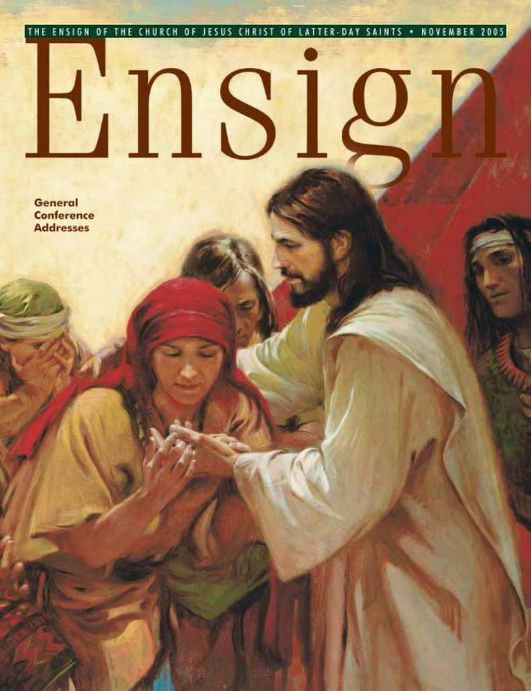
Figure 15. One by One by Walter Rane as it appeared on the cover of the November 2005 Ensign magazine.
Centralizing the Selection of Meetinghouse Artwork
Prior to the launch of the Church’s LDS.org website, official policies and guidelines were issued in print form and would be updated periodically upon changes in leadership or when improvements were made to practices and standards. In April 2008, for example, the Meetinghouse Artwork brochure was updated with First Presidency portraits and twelve new pieces of artwork. Adjustments to available sizes and frames were also made. Priesthood leaders, project managers, and facilities managers were given instructions on keeping a binder containing the Meetinghouse Artwork Guidelines, Meetinghouse Artwork brochure, price lists for available artwork, and “floorplans showing possible locations for artwork.”[44]
In June 2009, the guidelines found in the Meetinghouse Artwork brochure were changed to bring them into alignment with changes in the handbook and the Facilities Management Guidelines for Meetinghouses and Other Church Property. The new Meetinghouse Artwork Guidelines stated the purpose of artwork, giving a slightly expanded guideline on images of Christ and gospel subjects: “Artwork enhances the interior of meetinghouses by creating a spiritual, reverent atmosphere. The artwork should be of high quality and depict the life and image of Christ and His ministry with dignity and reverence. It should also teach gospel principles with clarity and accuracy through easily recognizable illustrations of the scriptures, and portray meaningful aspects of the Restoration of the gospel and the history and heritage of the Church.”[45] This seemingly inappreciable directive on acceptable artwork themes marked a shift toward Christ as the central identifying visual in meetinghouses.
In addition to this statement on the purpose of artwork in meetinghouses, the guidelines outlined the process of selecting “Church-approved artwork” through the Purchasing Reference Guide (PRG) and Church Distribution Services. After selecting suitable works from the official brochure and ordering them from the Purchasing Division, the meetinghouse project manager was instructed on where to place the artwork in the building. Referring to suggested locations on an attached floorplan illustration, they could place artwork above sofas, in wall niches or recesses, and above groupings of chairs, where “depictions of the Savior are appropriate.” Offices and high council rooms could feature First Presidency portraits and, of course, depictions of Christ, but the statement on the placement of pictures in rooms where Sunday worship services or sacred ordinances were to be conducted was kept virtually the same as it had been for years. “Artwork may not be placed in the chapel or near the baptismal font,” the guidelines stated. “Statues, murals, and mosaics are not authorized.” The exception to these restrictions was still in place, in parentheses: “This does not apply to works of art that have been on display for many years in the chapels of existing meetinghouses.”[46]
The Church’s Priesthood Executive Council continued to participate in the selection of images of Christ for classroom teaching, auxiliary instruction, and use in the homes of Church members. After nearly seventeen years of use by Church members, the Gospel Art Picture Kit was superseded in October 2009 by the introduction of a new Gospel Art Book, which contained illustrative images of Church themes for use in Church and in the home. When the book was issued, Michael G. Madsen of the Church Curriculum Development department wrote: “In the office of President Thomas S. Monson hangs a painting of the Savior by artist Heinrich Hofmann. The prophet says that this painting reminds him to do what the Savior would have him do. Pictures can have a powerful influence on each of us, just as this painting does on President Monson.”[47]
The book featured 137 pictures—illustrative paintings and photographs—that could be used in the home or at church for gospel teaching and learning. The pictures were organized into six sections: (1) Old Testament, (2) New Testament, (3) Book of Mormon, (4) Church History, (5) Gospel in Action, and (6) Latter-day Prophets. Of the 137 images comprising those sections, fifty-nine images depicted Christ or events in his life. The artists whose work illustrated scenes or events in Christ’s ministry included Harry Anderson, Alexandre Bida, Carl Bloch, Grant Romney Clawson, Gustave Doré, Ted Henninger, Heinrich Hofmann, Greg Olsen, Aldo Rebechi, John Scott, and James Tissot with new images by Joseph Brickey, Kamille Corry, Simon Dewey, David Lindsley, and Walter Rane. According to Madsen, “The new Gospel Art Book is an important tool that can help us help one another come unto Christ and receive the blessings of eternal life.”[48]
That same year, coincidental to the release of the Gospel Art Book, the Church revealed its methods in collecting, reviewing, and disseminating imagery to its worldwide membership. Improvements in digital storage and broadband speed gave the Church’s graphics department greater facility in distributing print-ready artwork: “In addition to hundreds of available fine art paintings and portraits, the Church utilizes a continually updated database called Telescope as a storage receptacle for more than 300,000 images describing and illustrating events, important sites and teachings of the faith,” stated a Church Newsroom press release.[49] “Such a resource, according to Allan R. [Loyborg], director of graphic design and production for the Church’s Curriculum Department, brings a readily accessible and broad range of illustrations forward to meet the publication requirements of the Church.” The Church’s image database description notably showed its awareness of the need for imagery applicable to a global Church. According to the news release, Loyborg’s staff organized and trained contract illustrators and photographers in many parts of the world “to bring local and cross-cultural representation to printed materials.”[50] Graphics could be modified or changed to better suit the people living the areas in which the materials are distributed. “For example,” Loyborg explained, “a recent brochure prepared for the Missionary Department contained the same text but featured illustrations based on the geographic distribution—some were printed with people from Eastern Europe, Scandinavia or South America. This design localizes the message and creates a pocket of cross-cultural communication.”[51]
In the spring of 2010, the existing Meetinghouse Artwork brochure and the Church Educational System’s art catalog were combined into a single online catalog entitled Church Facilities Artwork Catalog. A link to this website became available on the home page of the Church Facilities Department’s Architecture, Engineering, and Construction (AEC) website.[52] Those who selected artwork for Church facilities (particularly meetinghouses, seminaries, and institutes) were referred to this website. The website also featured artwork appropriate for mission facilities and welfare complexes.[53] This resource included the familiar images of Christ by Bloch, Hofmann, Anderson, and Parson. Thus, “Church-approved artwork” for meetinghouses, including images of Christ, was to be obtained through the facilities manager using this new catalog. The facilities manager could also obtain artwork “appropriate for meetinghouses” from Church Distribution Services, but it also had to be properly framed.[54]
Correlative selection also led to the replevining (repossession), disposition, and sometimes replacement of historical works of art in meetinghouses. Under senior museum curator Robert O. Davis’s direction, the Church Museum of History and Art formed what was called the Art and Artifact Committee and conducted a survey of ward meetinghouse art from 2010 to 2013.[55] Historical works of art in Church meetinghouses were documented, appraised for their significance, and assessed a market value. Surveyor’s reports were submitted to the committee and filed in museum records by their type of artifact, description, location, and geographic region. These surveyors’ reports and assessments are restricted to researchers, but the data collected set the groundwork for the eventual decision to replevin some historical works of art from temples and meetinghouses for preservation.[56] Works of art that were deemed at risk or deteriorating were photographed, removed, and/or replaced with high-quality giclée reproductions or with artwork presumably deemed more pleasing and Christ-centered to viewers.[57]
In addition to the assessment and valuation surveys collected by the Art and Artifact Committee, guidelines based on those surveys were established for existing artwork in meetinghouses or art placed in historic properties. The AEC Design Guidelines (2015) give instructions for selecting and placing artwork in such meetinghouses. “Standard meetinghouse artwork is generally appropriate,” it states. However, the guidelines specify the actions that should be taken when the quality and appearance of the frames is in question. “Custom frames may be appropriate to be consistent with the style and character of the building. Existing artwork that is inappropriately scaled, framed, or faded should generally be discarded and replaced in accordance with the meetinghouse art and artifact inventory. Although the stake president may still have input, the selection and placement of artwork should be reviewed and approved by the Church History Department.”[58]
Actions taken for the selection, commissioning, or preservation of temple artwork reflected the collective decision-making of at least three correlative committees. The Temple Art Committee (TAC), which is alternatively known as the Art Evaluation Committee or Church Art Committee, proposes artists and evaluates the appropriateness of their artwork for temple projects.[59] Formed in 1981 as an outgrowth of the Priesthood Executive Council’s oversight of the Church’s visual resources and the formation/planning of the Museum of Church History and Art, the committee was intended to better coordinate the display and preservation of the Church’s existing and commissioned collections of original artwork. The TAC is comprised of member art educators, curators, dealers, and administrators who could also identify member artists whose work would be well suited for placement in temple interior spaces.[60] The TAC is instrumental in supporting the Curator and temple art curators in commissioning and placing original artwork in temples. Two other committees—the Temple Facilities Sites Committee (TFSC) and the Temple Sites Committee (TSC)—give final approval to works chosen for temple interiors. While the TFSC is mostly comprised of members of the Architecture, Engineering, and Construction Division, it considers the suitability of artwork for temples and answers to the Office of the Presiding Bishopric. The TSC is comprised of representatives of the Presiding Bishopric and the First Presidency who give final approval for proposed artworks for temple projects.[61]
Members of the TAC and representatives of the Special Projects Department of the Temple Design Division work closely with individual artists on the appropriateness of the finished art for display and the physical installation of their artwork in temple interior or exterior spaces. While the committee is often described by its members as inclusive and encouraging of innovative member artists, only about half of their selections are approved by PEC advisors and even less by the Office of the Presiding Bishopric, often regarded as the “bottleneck” of the art selection process. These lags and rejections in the art vetting process can be inhibiting but are also indicative of the overarching influence correlation has on the Church’s visual culture.[62]
The placement and preservation of temple artwork does not always occur without dispute, either. A controversial decision to replace the deteriorating interior walls of the Manti Temple in 2021, including the removal of beloved mural artwork by Minerva Teichert and C. C. A. Christensen, prompted forceful pushback from concerned Church members. After Church officials announced that the walls and the murals adhered to them would be removed permanently during renovation, a groundswell of Church members living not only in Manti but throughout the state of Utah protested.[63] In the end, after considering the intense support for preserving the artwork, Church History Museum officials and temple art curators announced that they would consult with international art conservation experts and try to separate the canvas or portions of it from the plaster and preserve pieces of the mural for restoration, preservation, and public display elsewhere.[64]
Correlated Art, Church Doctrine, and Piety
The careful selection of artwork that accurately supports and reflects the doctrines, messages, and policies of the Church is borne out by comparing the imagery with associated religious texts. As I pointed out in my 2000 study, the depiction of Christ as a neatly trimmed, wholesome man coincides with the Church’s policy regarding the portrayal of deity in live performances in meetinghouses. The 2010 edition of the Church’s handbook expressly stated that “if the Savior is portrayed, it must be done with the utmost reverence and dignity. Only brethren of wholesome personal character should be considered for the part.”[65] In keeping with this and other official texts, correlated and approved images of Christ typically depict him as having pale skin and Germanic features with a well-groomed beard and hair, wearing a clean, wrinkle-free tunic, and bearing unsoiled hands and feet (fig. 16).
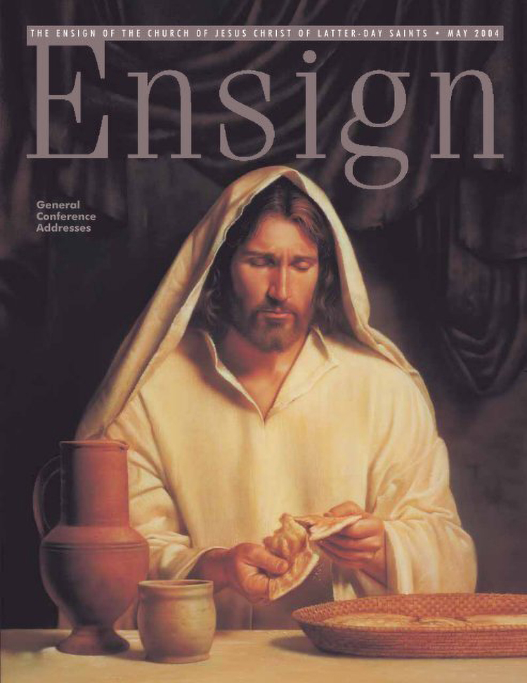
Figure 16. The Last Supper by Simon Dewey as it appeared on the cover of the May 2004 Ensign magazine.
In an August 5, 2011 article published by the Church Newsroom, Chelsee Niebergall wrote about the usefulness of art in daily worship: “Whether in homes, meetinghouses, temples, or elsewhere, good art can encourage a spirit of worship. For that reason, the Church’s Printing Division has created a way to make fine art available at a low cost for use in members’ homes and Church buildings worldwide.”[66] Niebergall assured readers that the Church was not only making these pieces of gospel-themed art available in Church magazines and on its websites but also printing them and providing them for purchase on the Church’s online store. “The goal of all these products is to help bring people to Christ,” said Dennis Smith from the Church’s Printing Division. “Art has a wonderful way of doing that. These beautiful printed scenes remind us of scripture stories or historical events or specific individuals, so all of these different depictions help teach us, inspire us, and remind us of the Savior.”[67]
The correlative review—and sometimes careful editing—of images of Christ used in official Church publications continued to take place well into the new century. In some instances, the Church’s Graphic Design and Production Department took active measures to alter or manipulate artwork to make it acceptable for publication. For example, in cover art of the March 2013 issue of the New Era (the Church’s magazine for adolescents), the attending angel in Carl Bloch’s Christ in Gethsemane (1873) was so tightly cropped that its wings were rendered unrecognizable to the viewer—presumably in keeping with the 1998 PEC review of images (fig. 17). In another example, in the December 2011 issue of the Ensign, Bloch’s painting The Resurrection of Christ (1881) was graphically altered to conform to Church standards (fig. 18). The Salt Lake Tribune religion writer Peggy Fletcher Stack noted, “Bloch’s female angels were given cap sleeves on their shoulders (likely reflecting the Utah-based Church’s modesty stance).”[68] The removal of the wings was indicative of the Church’s scriptural literalism or naturalistic interpretation of otherworldly beings and events. “Mormons teach that angels are resurrected humans,” Stack added, “so giving them wings flies in the face of that belief.”[69] In yet a third example, Mary’s décolleté as depicted in Carlo Maratta’s nativity The Holy Night (ca. 1655) was Photoshop-modified in 2016 to conform to Church modesty standards. Three winged angels flanking Mary were removed and her neckline was raised to cover her bust and shoulders before the painting was published on the Church’s website.[70] Salt Lake Tribune columnist Gordon Monson wrote that the image alteration sends a message to women in the Church that “there’s something shameful about their bodies.”[71] Monson argued that the shame put upon women from such an overemphasis on keeping themselves covered for modesty backfires on the Church, “not just in the harm it creates among women and women’s self-esteem, but also in sexualizing them as objects or, even worse, possessions.”[72] The editing of these images was no small controversy to those who recognized the changes, but the use of images that align with the Church’s beliefs, moral standards, and scripturally based doctrine served to visually affirm their importance and veracity for Church members.[73]
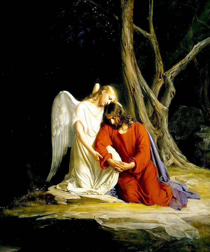
Figure 17. Christ in Gethsemane (1873) by Carl Bloch. Public domain.
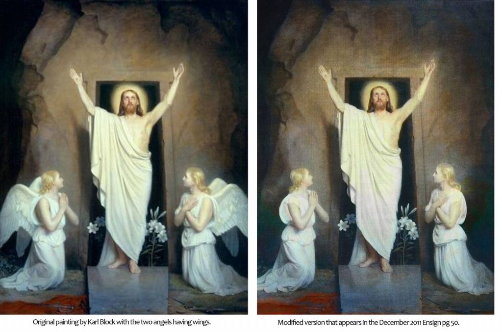
Figure 18. Comparison of Carl Bloch’s The Resurrection (1881) showing the modification of the angel’s wings and sleeveless robes. Image courtesy of rogerdhansen.wordpress.com.
In the more than two decades since the appearance of my original study, interested scholars and investigators of Mormon culture focused their attention on religious art as a powerful tool for expressing religiosity. For example, in 2001, during what was then called the “Mormon Moment,” when Salt Lake City was preparing for the 2002 Winter Olympics, Kenneth L. Woodward of Newsweek cited my survey of the number of images of Christ used in the Church’s Ensign magazine.[74] In a February 2002 devotional lecture at BYU–Hawaii, psychology professor Ronald S. Jackson discussed the importance and efficacy of religious images among Latter-day Saints. Citing my 2000 study and others by Colleen McDannell and David Morgan, Jackson presented the results of his own research on the use of pictures in the homes of active Latter-day Saints.[75] Similarly, in a book-length study on Jesus in American culture, religious studies scholar Stephen Prothero addressed Christ-centered visual culture as a reflection Latter-day Saint devotion. Prothero’s book American Jesus (2003) was a fascinating chronicle of the various iterations of Jesus in America’s hearts, minds, and media.[76]
In 2016, historian and religious studies professor John G. Turner published his masterful study on the place of Jesus Christ in Latter-day Saint culture and spirituality. The book, entitled The Mormon Jesus: A Biography, documents the development of the Church’s Christ-centered doctrines. As a biographical work, Turner’s study takes readers through a storied history of Mormon belief in Jesus Christ, from Joseph Smith’s First Vision encounter with deity to his central place in the Mormon doctrine of atonement, his mortal ministry, and post-resurrection visit to the people living in the Americas. A chapter focusing on New Testament and Book of Mormon artistic depictions of Christ reiterates much of what I covered in my own study on visuals of Christ. In that chapter, Turner discusses the racial dynamics and emphases on strength of power and Christian manhood that influenced the early choices of images of Christ in Mormon visual culture. To explain the Church’s unwavering favor of artwork depicting Christ as a white man, Turner reviews the Church’s early statements on race, along with passages from the Book of Mormon that describe the dark skin of Native American people as a curse placed upon them for iniquity. As Turner further indicates, even though the Book of Mormon does contain some egalitarian statements on race, it describes Jesus as being pure or radiantly white (3 Nephi 9:30) and his mother Mary as “exceedingly fair and white” (1 Nephi 11:13).[77]
Echoing what I characterized in my 2000 study, Turner writes that “the church today favors images of Jesus by both Mormon and non-Mormon artists that balance noble strength with tender concern and contemplativeness. Indeed, the Mormon Savior is the Good Shepherd, the one who welcomes children, the one who reclines on a hillside in prayer. The Mormon Jesus is like the contemporary Mormon man, strong and fit, busy serving his family and community, cherishing a brief moment alone with his Heavenly Father.”[78] Turner goes on to name several LDS artists whose paintings of Christ reflect these outward ideals. “One sees this image of Jesus Christ in the paintings of contemporary Mormon artists such as Greg Olsen, Simon Dewey, Liz Lemon Swindle, and Ted Henninger. Jesus is a tender shepherd, the savior who welcomes children of all races, and the risen Lord.”[79]
Turner’s characterization of official LDS Christ-centered art—as well as the insightful scholarship of Prothero and others—encapsulates the outcome of the Church’s correlative decision-making. While many examples of unofficial gospel-themed art could fit those characteristics, a profusion of artistic expressions was created by faithful LDS artists who benefited from efforts to foster interpretations of Jesus and his ministry. Out of a growing desire to explore and expand broader possibilities of Christ-centered imagery, museums and arts organizations started programming creative opportunities outside of the Church’s correlated curation of artistic images. An unofficial art competition, Spiritual and Religious Art of Utah, which began in 1986 and is sponsored by the Springville Museum of Art, offers Utah artists an opportunity to express their beliefs without content or style restrictions. What’s more, beginning in 1987, the Church began sponsoring its triennial International Art Competition in which member artists from around the world participate, submitting two- and three-dimensional artwork. Although the international competition promotes a different gospel theme each time, the submitting artists aren’t required to follow a prescribed manner or approach. While the exhibited artwork still has to pass through correlative selection and approval, Church authorities and museum curators consistently praise the diverse artistic interpretations of gospel themes, with many of the submissions employing unique cultural motifs, folk methods, and varied materials and styles.[80]
These two competitions were inaugurated almost concurrently and gave faithful member artists new venues for interpreting spiritual or religious subjects—including images of Jesus Christ—without an expectation by a Church evaluative committee of realism or an illustrative style. Other competitions have followed and, although not official Church-sponsored events, they are often endorsed (if not financially supported) by individual Church authorities. Beginning in 2009, the Inspirational Art Association (IAA), an independent Utah-based organization, has sponsored a Christmas Season Art Showcase at the Joseph Smith Memorial Building. This competition—open to all IAA members who follow its mission—is meant to foster and promote art that, according to its official website, “embodies truth, beauty, hope, faith and goodness.”[81] Independent organizations such as the Zion Art Society and Certain Women were established to foster the work of LDS artists in Utah. The Zion Art Society was founded by Micah Christensen in 2016 to “create a place for LDS artists and serious collectors to collaborate and create art that advances the fine arts in the LDS Church.”[82] A Salt Lake City–based organization, Certain Women was organized in 2019 by Nicole Woodbury, Laura Erekson Atkinson, and Mary Brickey Cole to promote LDS women artists and offer competitive invitational exhibits to showcase their work.[83] The Center for Latter-day Saint Arts, based in New York City, collects, promotes, and displays literature, performing arts, and visual art from all over the world.[84]
Opportunities such as these have been viewed by many Latter-day Saint artists as a welcome change or an evolution in LDS art. Religious art that was once seen as having to conform to didactic and illustrative norms can now be expressed in limitless ways. In 2013, St. George Spectrum features reporter Brian Passey observed, “Today’s LDS art landscape is one of stylistic diversity that has room for impressionistic painters like [Julie] Rogers or Woodland Hills artist J. Kirk Richards, whose work ‘floats somewhere between classicism, primitive expressionism and naturalism.’”[85] The encouragement and fostering of religious art without stylistic restrictions has afforded Church members limitless capacities to express their artistic visons of Jesus, while Church correlation committees have continued to unveil or issue acceptable, approved images of Christ in official print and digital media (fig. 19).
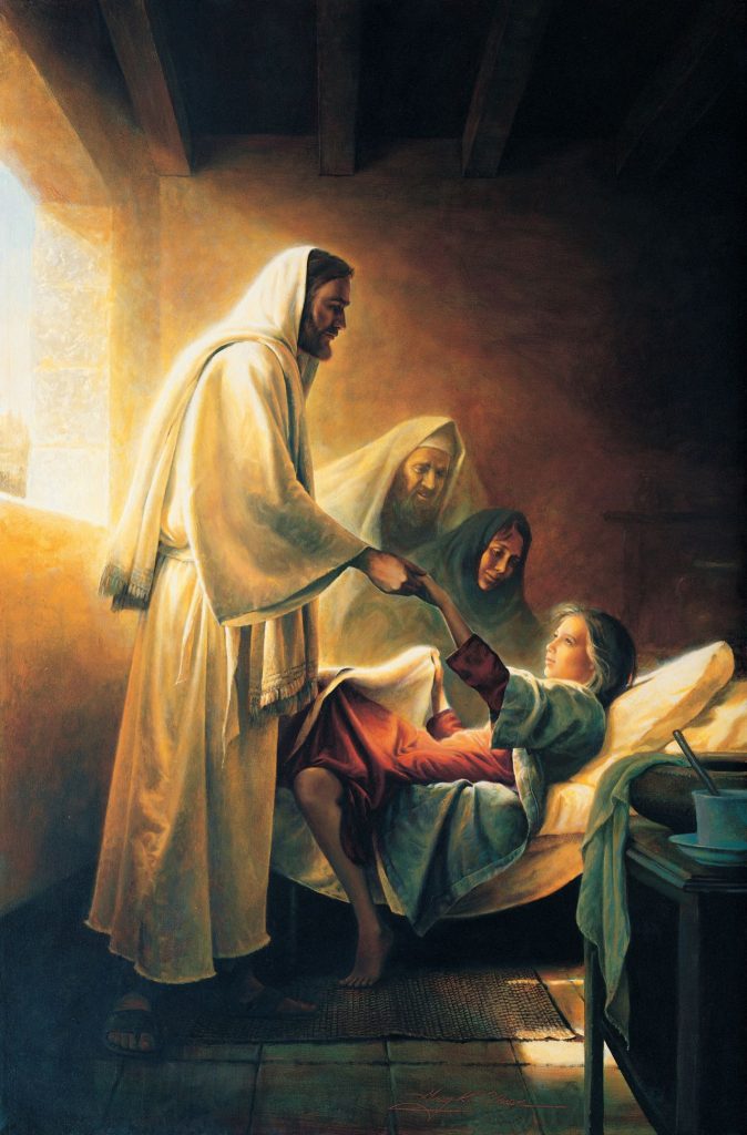
Figure 19. Jesus Blessing Jairus’s Daughter (Christ Raising the Daughter of Jairus) by Greg Olsen. Copyright by Intellectual Reserve.
Through PEC oversight, Church leaders commissioned new art and applauded the many examples of self-expression among its members. Articles in LDS digital magazines, Utah newspapers, blogs, and BYU academic journals promoted the varied examples of religious imagery among member artists.[86] One article in the Deseret News highlighted the diverse art in the Sixth International Art Competition (2003) in which the Museum of Church History and Art received over seven hundred entries from the United States, Latin America, Africa, Asia, Europe, and the British Isles. Senior curator Robert O. Davis reportedly said of J. Kirk Richards’s purchase-award-winning entry, Son of Man: “We like these more inward expressions of the Savior,” he said, referring to Richards’s soft-edged but tenebrist portrait of Christ. “This one applies to the Atonement, but it’s not as didactic in his illustration, not as obvious, so there’s more of a mood and personality that comes through. An ambiguous expression that people can identify with.”[87] A dichotomy of institutionally approved images of Christ and democratically produced, accessible renderings of Christ by Church member artists resulted (fig. 20).
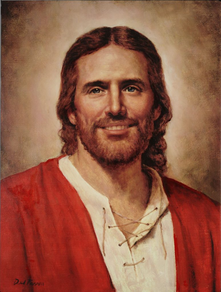
Figure 20. Christ’s Love by Del Parson. Image courtesy of the artist.
Del Parson, the artist widely known among Mormons for his red-robed portrait of Christ, was commissioned to paint numerous works depicting the ministry of Christ or events in the Church’s history. One particular painting, entitled Christ and Children from Around the World (Christ with Children), featured what appears to be two white children, a Hispanic child, and a child of African descent surrounding a seated Jesus (fig. 21). On his personal website, Parson told the story of its conception:
A member of the Primary General Presidency visited the members of the Church in Africa. Following her trip, she felt that the Church needed a depiction of Christ with children those members could relate to. The Church commissioned the painting and I used my son, a friend from his soccer team, one of his classmates, and a ward member to pose for this painting.[88]
After the painting was unveiled, it was placed on temporary display at the Joseph Smith Memorial Building in Salt Lake City and has become a widely published visual example of the Church’s belief in diversity and inclusivity.[89]
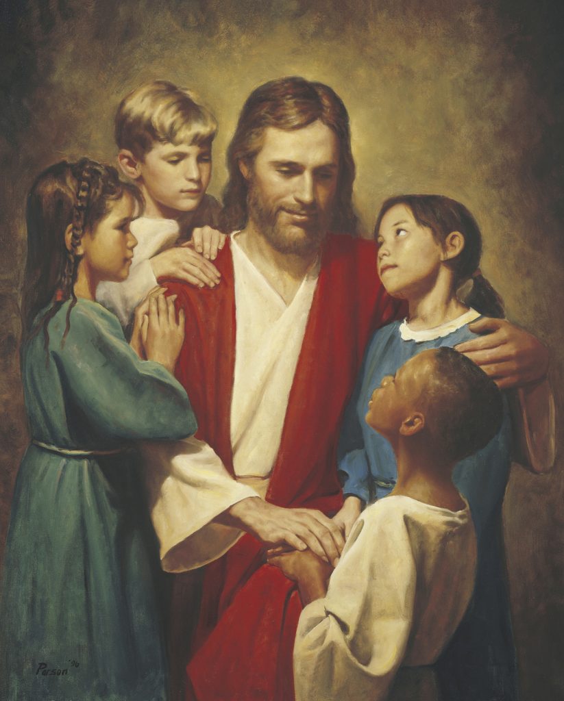
Figure 21. Christ and Children from around the world (Christ with Children) by Del Parson. Copyright by Intellectual Reserve.
Many other member artists have since added their works to the growing body of Christ-centered art that celebrates culture, gender, and race among Church members. Contemporary LDS artists have contributed meaningful representations of the diversity of Church membership that go against the long-standing predominance of white subjects and white-centric narratives in Church art. Artists such as Rose Datoc Dall, Melissa Tshikamba, Kwani Povi Winder, and Sopheap Nhem are creating Christ-centered works that are shattering racial stereotypes and expectations set by misdirected Church doctrines and boundaries set by Correlation (fig. 22).[90]
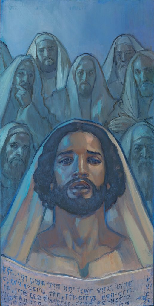
Figure 22. Anointed One by Rose Datoc Dall. Image courtesy of the artist.
Church Branding
The careful selection of religious images and, more specifically, visuals of Christ representative of the Latter-day Saint Church extended into institutional branding. It has been pointed out by designer and typographic expert Stephen Coles and others that the Church did not have an identifiable visual identity until 1974 when Randall Smith and his design team created a wordmark logo that used Baker Signet, a typeface designed a decade earlier by Arthur Baker for Visual Graphics Corporation (VGC).[91] This multilayered wordmark, as Coles explains, was “well suited for the granite inscriptions that often label meeting houses and temples.”[92] The open font gave the wordmark a classical but easy-to-read layout that was recognizable and a pleasant identifying quality that emphasized the full name of the Church (fig. 23). It was ubiquitous on meetinghouse signage, missionary name tags, letterheads, and forms until 1995, when Church administrators decided that “this design was too corporate (and maybe too chaotic), but more importantly they wanted to clarify that they are a Christian religion.”[93]
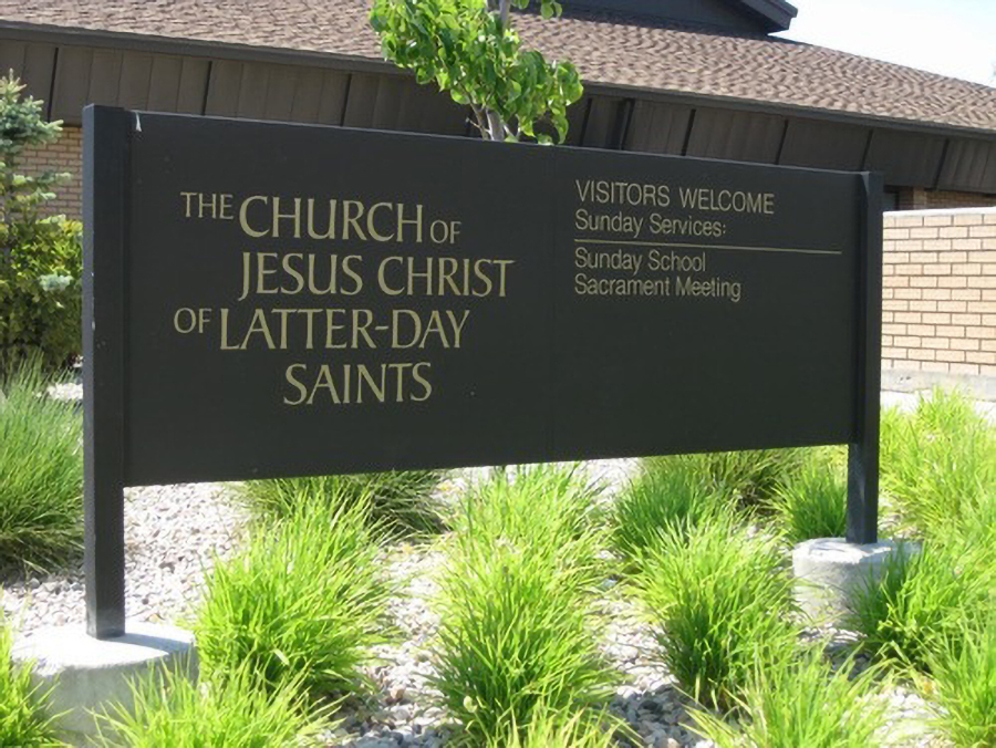
Figure 23. Official word mark, The Church of Jesus Christ of Latter-day Saints, 1975, shown here on meetinghouse signage. Photo by Randall Smith for the Salt Lake Tribune.
According to various extant accounts, the 1995 wordmark was designed by Adrian Pulfer and McRay Magleby with a proprietary typeface called “Deseret” designed by renowned typographer Jonathan Hoefler.[94] This new, collaborative design was formal and symmetrically balanced, featuring the Church’s title in three lines centered (fig. 24). The name “Jesus Christ” was enlarged and centered as the emphasis of the wordmark. According to designer Brian Collier, the typeface was inspired by the classical Trajan font, a letterform that is reminiscent of texts chiseled into Roman monuments.[95] This simple, straightforward wordmark logo served the Church during the rise of the internet and the growth of the digital age. The ubiquitously distributed visual helped recast the Church’s worldwide image for a greater focus on Christ without changing the long-standing name and corporate brand.[96]
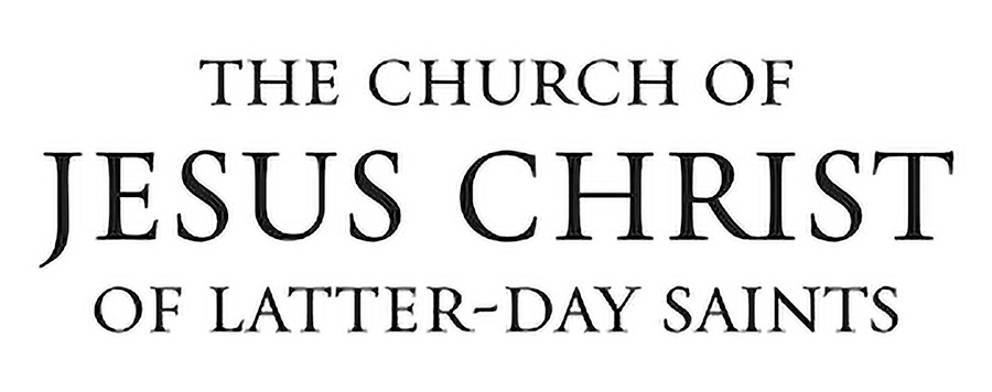
Figure 24. Official word mark, The Church of Jesus Christ of Latter-day Saints, 1995. Copyright by Intellectual Reserve.
However, after the passing of Church president Thomas S. Monson on January 2, 2018, the newly called president, Russell M. Nelson, pursued a new course in image-making and branding the Church’s institutional presence. In the first four years of his presidency, Nelson made more than seventy changes, including reducing the length of Sunday meetings from three hours to two hours, renaming the Church websites and social media, allowing baptisms of children with LGBT parents, issuing a new handbook, and instituting policy changes for civil and temple marriages. Of the many sweeping changes, Nelson sought to discontinue the widespread use of the nicknames “Mormon” and “LDS” in favor of using the full name of the Church. During the April 2020 general conference, after the COVID-19 pandemic broke out, Nelson also unveiled a new wordmark, or what he called “a symbol,” which was meant to replace the decades-old 1995 wordmark.[97]
This symbol—essentially a logo—features a simple stipple point and line drawing of Bertel Thorvaldsen’s Christus over the wordmark set in a rectangular box. “At the center of the symbol is a representation of Thorvaldsen’s marble statue the Christus,” said Nelson. “It portrays the resurrected, living Lord reaching out to embrace all who will come unto Him. Symbolically, Jesus Christ is standing under an arch. The arch reminds us of the resurrected Savior emerging from the tomb on the third day following His Crucifixion.”[98] The new symbol, he added, should feel familiar to all identifying the restored gospel with the living resurrected Christ. The name of the Church is placed within a rectangular shape representing the Church’s foundation, Jesus Christ being the chief cornerstone (Ephesians 2:20). Although it was stressed that the website name changes, the reaffirmation of the Church’s original name, and the new symbol did not constitute rebranding, the press packet and logo guidelines that accompanied the new trademark image suggested otherwise. Nelson further explained, “The symbol will now be used as a visual identifier for official literature, news, and events of the Church. It will remind all that this is the Savior’s Church and that all we do, as members of His Church, centers on Jesus Christ and His gospel.”[99]
Despite some controversy raised by critics during Mitt Romney’s presidential campaign in 2012—a second “Mormon Moment,” when the Christus statue was deemed “an icon of white supremacy”[100]—Nelson felt that an image of the sculpture would embody or best represent a renewed focus on Christ as the head of the Church (fig. 25). An official news release written by Sydney Walker explained the purpose of the symbol, emphasizing that it is not a logo.[101] Quoting Nelson’s symbol unveiling address, Walker underscored the message conveyed by the image of Christ with open arms. “The new symbol is part of President Nelson’s emphasis on the name of the Church and is not a rebranding effort, the Intellectual Property Division reaffirmed. It’s about correct communication,” she wrote.[102] “While a logo is often used to brand products, a symbol represents or stands for something—in this case, the Savior as head of His Church. As President Nelson explained, the symbol is ‘to help us remember Him and to identify the Church of Jesus Christ of Latter-day Saints as the Lord’s Church.’ The symbol ‘will signify the central place of Jesus Christ in His Church.’”[103] The new symbol and use of the Church’s name or trademarks, however, would follow typical service marks guidelines for other corporate entities. Berne Broadbent, director of the Intellectual Property Division of the Church, reportedly explained that to avoid confusion and ensure appropriate legal protections, “we anticipate that the final guidelines for using the new symbol will be somewhat similar to the current guidelines for the use of the Church logo.” He further explained that Church members generally wouldn’t use the symbol, but “the Church would use the symbol as a way of identifying official Church material.”[104] The Church Style Guide for Editors and Writers (Sixth Edition) indicates that “The Church logo should be used only on official Church products that have received Correlation approval.”[105] Anyone seeking questions about requirements or exception requests are directed to “contact the Visual Identity Office in the Correlation Department.”[106]
Figure 25. Official symbol (logo), The Church of Jesus Christ of LatLatter-day Saints, 2021. Copyright by Intellectual Reserve.
Nelson’s continued commitment to branding the centrality of Christ extended to increased standardization of meetinghouse imagery. Another announcement affecting the Church’s visual identity came in a letter issued by the First Presidency on May 11, 2020, further establishing Nelson’s efforts to recommit Church members to placing Christ as the central focus of daily worship.[107] “To testify further of our central belief in Jesus Christ, we desire that our meetinghouses reflect an attitude of reverence for the Savior,” the letter stated. “Therefore, the placement of art representing Jesus Christ in meetinghouse foyers and entryways, has been authorized. Local facilities managers will contact and work with stake presidents to evaluate foyers and make necessary modifications consistent with the attached guidelines.”[108]
The document issued by the First Presidency, “Principles and Guidelines for Meetinghouse Foyers and Entries” (2020), gives specific instructions on the selection of approved artwork for Church meetinghouses, beginning with principles that supersede all previously issued instructions for priesthood leaders and facilities managers. “Meetinghouse foyers and entries should create a feeling of reverence and dignity,” it begins.[109] “These spaces establish the first impression and feelings that individuals receive when entering a meetinghouse. Furnishings and artwork enhance the interiors of foyers and entries and help create a spiritual, reverent atmosphere. Artwork can also inspire faith and teach principles of the gospel. Framed artwork that focuses on the Savior should always be displayed.” The document then outlines instructions that will affect the fixtures and artwork of Church meetinghouse interiors for years, perhaps decades, to come (fig. 26). Indeed, the many years of creating unique sacred spaces by placing pictures of local Church leaders, paintings by local member artists, photos of ward sports teams, and display cases with awards and trophies—all done autonomously by ward and stake leadership—came to an end with these instructions:
- Place existing artwork that depicts the Savior Himself or the Savior ministering to others in the meetinghouse entries and foyers. Examine existing artwork to ensure that it is appropriately framed, displayed, and in good condition.
- Move other artwork to another location within the facility or remove it altogether.
- Choose replacement art, if needed, from the Approved Selection of Foyer Artwork and follow approved sizes and quality standards.
- Assess entries and foyers as part of an annual inspection to evaluate existing furnishings, artwork, and finishes. Replace and update as needed to maintain a feeling of reverence for the Savior.
- Remove from the foyer areas distractions such as display cases, bulletin boards, tables, easels, and damaged furniture.
What had been the longtime prerogative of local leaders now fell under a Churchwide facilities policy. The selection and placement of meetinghouse artwork was now fully retrenched or dictated by these guidelines and a selection of approved images. This action—another correlative measure—recalled the 1981 changes in the design of the Church’s meetinghouses themselves to a selection of simplified, versatile floorplans for economy, flexibility, and uniformity.[110] The standardized style and appearance of both the interior decorative elements and the exterior design of the Church’s meetinghouses was now fully guided by Correlation policy.
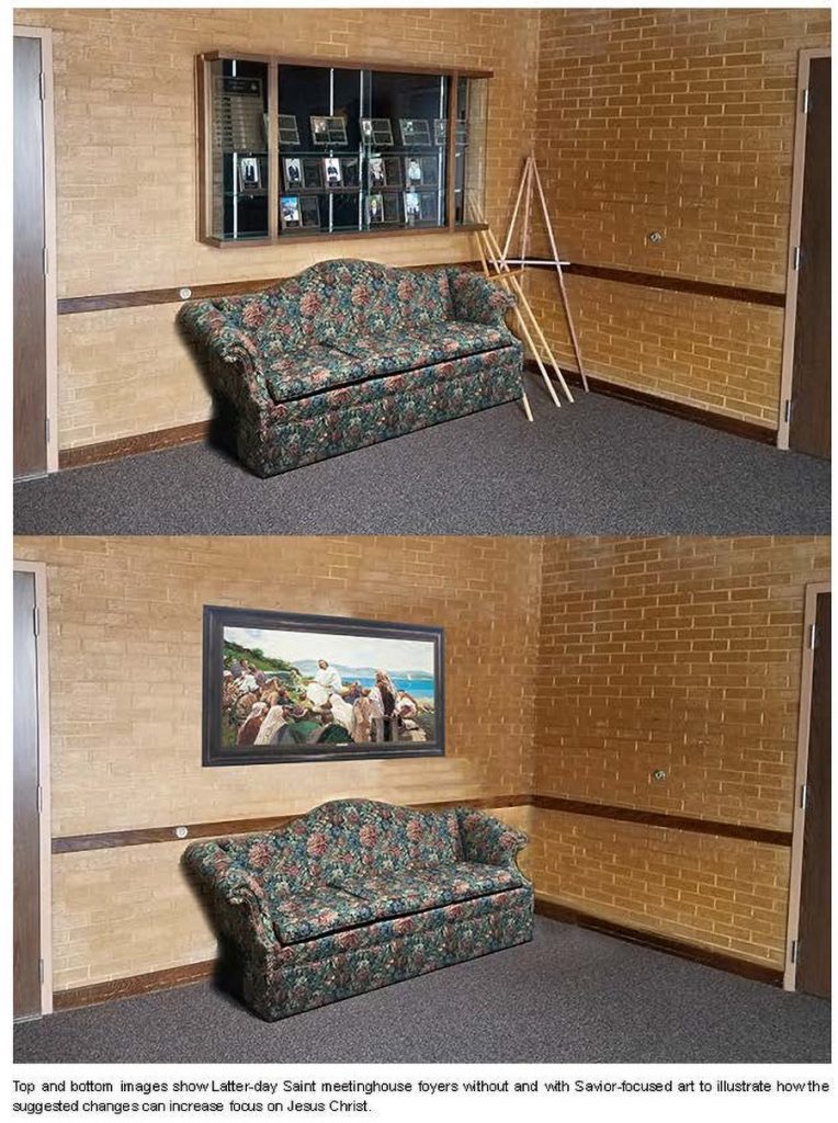
Figure 26. Photo showing how foyers should look after 2021 artwork policy change. Photo from Church News.
The guidelines for placing the artwork were very similar to what had been published in the 2009 Meetinghouse Artwork brochure, but the document now stipulated that artwork selected for foyers and entries “should come from the Approved Selection of Foyer Artwork.” The appended list and color thumbnails show the names and titles of twenty-two approved works of art depicting Christ in scenes of his ministry by a total of nine artists: Harry Anderson, Carl Heinrich Bloch, Crystal Close, Simon Dewey, Heinrich Hofmann, Michael Malm, Del Parson, Walter Rane, and Liz Lemon Swindle (figs. 27–29).
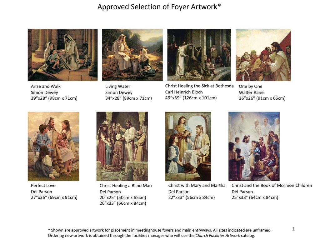
Figure 27. Page 1 of “Approved Selection of Foyer Artwork,” issued by LDS Church authorities, March 2021.
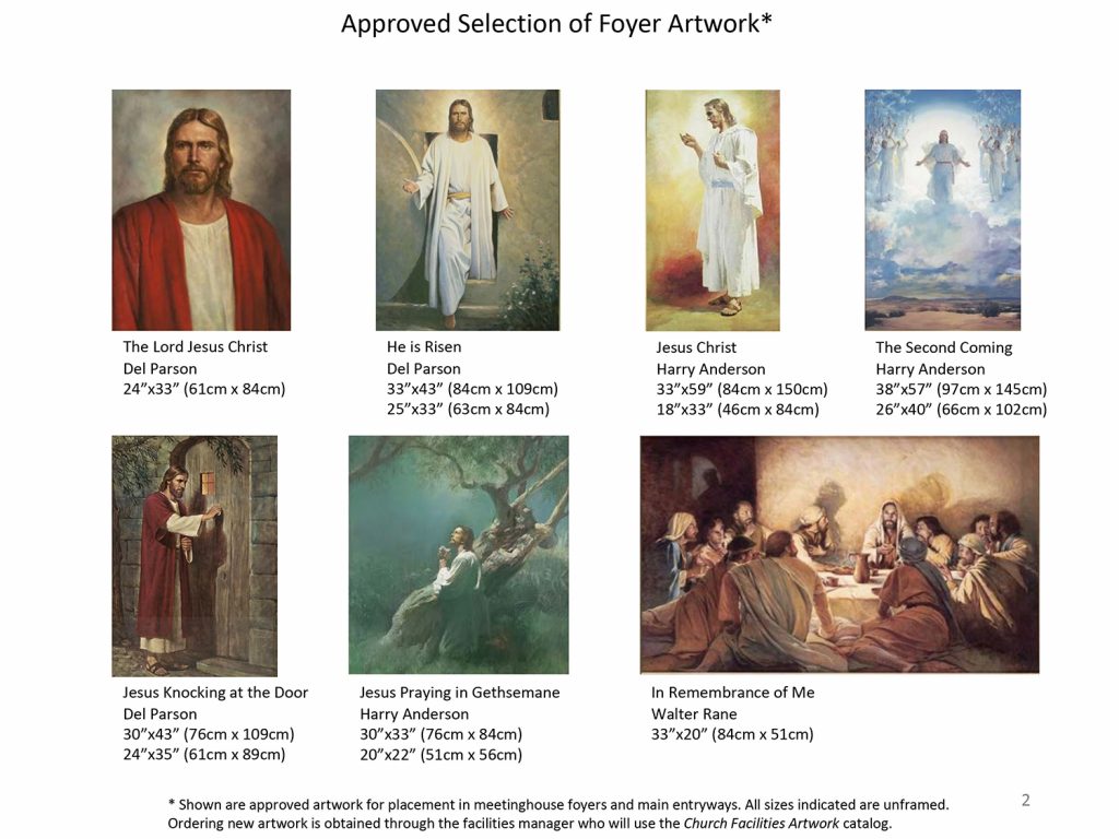
Figure 28. Page 2 of “Approved Selection of Foyer Artwork,” issued by LDS Church authorities, March 2021.
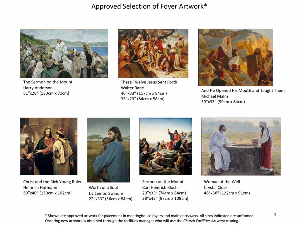
Figure 29. Page 3 of “Approved Selection of Foyer Artwork,” issued by LDS Church authorities, March 2021.
While these paintings are beautiful by most standards, they all depict the figure and visage of Christ in a traditional realistic manner and with the centuries-old and historically expected white or European physical traits. Each artist, of course, manifests individuality in approach, but their work is clearly chosen for its naturalism as a visual reinforcement of the scriptures—in support of what I previously called a literal interpretation of the New Testament and other LDS scripture bearing witness to the reality of Christ. The rendering of Christ in nearly all these approved images does not, however, emphasize his manhood or strength of power, as in some earlier Catholic, Protestant, and LDS images, but instead highlights his qualities as nurturer, teacher, and minister. Some are relatively static portraits, but most of them portray Christ interacting with disciples and ministering to the indigent, the disabled, and young children.
While some members applaud the Church’s correlative selection and placement process, others view it as visually stifling. Some see it as meaningful but not progressive. “The church is clearly . . . moving away from images that are particular to Mormons. Only two of the images [in the pool of twenty-two] are scenes from the Book of Mormon,” Margaret Olsen Hemming, then editor-in-chief of the Mormon feminist magazine Exponent II, commented in a blog post. “I love the idea of featuring works on our walls that center around Christ. But the figure of Christ that consistently appears in every single image in this group is comely, quiet, unemotional, and extraordinarily European.”[111] For her part, she saw the change to a small, selective group of art as disappointing for its lack of ethnic and physical diversity, absence of emotion, and depiction of women as vapidly devotional and domestic. Hemming further observed that “in a time when art by Mormon artists is of higher quality and more available than ever before, there is simply no excuse for this narrowing up of the way we convey the human relationship to the divine.”[112] Besides being regarded as a reflection of the way the Church wishes viewers to perceive their relationship with Christ, the careful selection of images, the reduction in the size of the pool of approved images, and their in-house production are viewed as actions taken for retrenchment and centralized control over their style and use in LDS visual culture.[113]
Despite the Church’s denials, establishing a policy of allowing only Christ-centered artwork in Church meetinghouses and introducing a new logo wordmark can rightly be classified as an institutional rebranding effort. Thorvaldsen’s Christus, although it was created by a Danish Lutheran in the early nineteenth century, has become associated with LDS worship since its use as the centerpiece of the Mormon Pavilion at the 1964–65 New York World’s Fair.[114] Also, having long been seen in temple visitors’ centers worldwide, the open-armed sculpture is now the visual identity of the Church in the same way that denominational logos each represent their churches.[115] This change in visual identity, along with Church president Russell Nelson’s insistence that members discontinue the use of the nickname “Mormon” or “LDS,” reflects the overarching intention to reaffirm that Christ heads the Church. A recent move to discontinue the placement of Moroni statues atop the Church’s temples is another method of redirecting focus from Book of Mormon–related icons to visuals of Christ. A Salt Lake Tribune article even noted a comment from Times and Seasons blogger Chad Nielsen, who wrote that the move marks “an important shift in branding and iconography” as the Church strives to put Jesus “front and center in our mentality as a culture and our image in the public square.”[116] Nielsen acknowledged the personal significance of the change. “There is a part of me that still cherishes my Mormonism and the use of Angel Moroni as the symbolic herald of the restoration,” he wrote, “but, as a Christian, I find the trajectory of focusing more fully on Jesus the Christ as the foundation and head of the church to be satisfying.”[117]
It should be noted here that the use of Thorvaldsen’s Christus as the logo image is not unlike logo and rebranding changes made by mainline Protestant institutions. The figure of a living Christ, however, was deemed to be more meaningful to Church officials than a cruciform, a monogram, or a letterform symbol often used by other Christian denominations. Though it was created by a Lutheran neoclassicist and long displayed in a museum in Copenhagen, the Christus has been associated with Mormonism since the mid-1960s and embodies the upright and welcoming traits the Church wishes to convey to its members and the public.[118]
Since the late 1960s, the LDS Church has placed copies of Thorvaldsen’s Christus in its temple visitors’ centers throughout the world and frequently used the sculpture as a graphic in official publications, so it came as no surprise that the Church decided to use the open-armed figure as the identifying logo image and Christ-centered symbol. The logo change stands as a capstone event in the Church’s decades-long efforts to create a visual identity. It most importantly serves to show that images (and figures) of Christ are central to Church’s print and digital presence. That Book of Mormon iconography and leadership imagery has been displaced or eliminated in favor of this symbol is illuminating. Of the many approved images of Christ, the figure of the Christus will supersede them all as the Church’s visual representation of a living Christ.
Conclusions
In the twenty-three years since the publication of my original article about images of Christ in Latter-day Saint visual culture, the LDS Church has taken gradual but methodical measures to affect institutional control over the selection and use of religious images in its official publications, their display in meetinghouses, and their dissemination digitally on the internet and on social media. Facing an increasingly secular global market, the Church has implemented measures to shape and affirm a distinctive style for the institution’s official media presence. Imagery made available to its members for use in print—and now in digital—media was and continues to be carefully chosen by select committees made up of art administrators and curators but overseen by priesthood authorities. The stylistic outcome for images of Christ has thus been an amalgam of individual preferences for expected physical traits of the Church’s central figure. Christ’s facial features, stature, and visual comportment conform to the combined expectations of the committees. During the first two decades of the twenty-first century, Christ-centered imagery was selected or recommended by informed individuals with artistic and curatorial expertise but collectively accepted or rejected by Church leaders with more corporate business acumen than eyes for aesthetics.
The prerogative of local leaders and Church members to select and place artwork of their choosing in ward meetinghouses was incrementally curtailed during the period between the institution of Correlation in the early 1960s and the recent decision by Church leadership to issue the “Principles and Guidelines for Meetinghouse Foyers and Entries” (2020) and its accompanying list of twenty-two approved images of Christ. By creating a pool of approved art through the careful, correlated selection of images of Christ and other religious imagery, Church priesthood leaders maintain a desired standard of orthodoxy of doctrine and a sense of uniformity of style in the Church’s visual culture. Adherence to the artwork use guidelines will centralize the oversight of interior design elements and ensure cohesion in the appearance of all Church meetinghouse entries, foyers, and sacred spaces.
Approved artistic images and illustrations uphold a realistic style meant to depict what is taught to be real historical people and events. As a visual corroboration of scripture—a biblical or scriptural literalism—images of Christ approved for official publications, member use, and for illustrating the Church’s doctrine leave no room for fanciful interpretations or deviations from what is expected in the natural world. Painted illustrations of Book of Mormon and Bible stories, New Testament narrative events, and scenes of Christ’s ministry are rendered in a classical, naturalistic manner—with no signs of abstraction or semi-abstraction, no subjective colors, and no depictions of anthropomorphic beings or fantastical appendages and ornamentations like wings or halos. They can be described as illustrative, instructive, or educational in approach, without any effort to change or distort reality for an emotional effect.[119] The relatively small selection of approved images for meetinghouses thus reveals a visual composite or profile of the ideal traits of Christ that the LDS Church wants its members and the public to see. It provides visual traits that make the Church distinct from what other mainline denominations include in their images of Christ. The images are distinct in characterizations of sentimentality embodied in a racially white European man, with Christ visualized as a master teacher, a contemplative shepherd, a nurturing father figure who tends to children, and an empathic man who ministers to the sick and needy. Physical and outward traits common to all images in the pool of artwork show that they reflect the Church’s selective Correlation process, which is partly aimed at uniformity. Distinctions between those in the pool and other Protestant and Catholic images of Christ show the traits the Church would like people to see and, conversely, those they wish to remain unseen in approved Christ-centered art. Although images of Christ used in Church publications, digital media, and meetinghouses today often bear a similar didactic realism to images chosen more than a century earlier, the mid-twentieth century desire to convey ideal Christian manhood and physical masculinity was replaced by depictions of Christ bearing traits of compassion, sensitivity, and domesticity. Correlative measures taken by Church authorities for meetinghouse art since 1990 have ensured the use of Christ-centered imagery with authenticity, a cohesion of appearance, an undeviating consistency in representational style, and an amalgam of these healthier masculine traits. Conclusively, however, the image of Christ that best conveys the true Latter-day Saint likeness may not be one that is “approved” by Church Correlation for its ostensible accuracy or realism but one bearing expressive attributes that resonate spiritually, ethnically, and culturally with both grassroots Church membership and observant nonmembers at large.
Note: The Dialogue Foundation provides the web format of this article as a courtesy. There may be unintentional differences from the printed version. For citational and bibliographical purposes, please use the printed version or the PDFs provided online and on JSTOR.
[1] For an informative history of LDS art and visual culture, see Nathan Rees, Mormon Visual Culture and the American West (New York: Routledge, 2021). For a collection of essays written by Museum of Church History and Art curators, see Richard G. Oman and Robert O. Davis, Images of Faith: Art of the Latter-day Saints (Salt Lake City: Deseret Book Company, 1995). On the use and reception of visuals in Nauvoo, see Noel A. Carmack, “Of Prophets and Pale Horses: Joseph Smith, Benjamin West, and the American Millenarian Tradition,” Dialogue: A Journal of Mormon Thought 29, no. 3 (Fall 1996): 165–76; Noel A. Carmack, “‘One of the Most Interesting Seeneries that Can Be Found in Zion’: Philo Dibble’s Museum and Panorama,” Nauvoo Journal 9, no. 2 (1997): 25–38; Jeffrey G. Cannon, “The Image as Text and Context in Early Mormon History,” in Foundational Texts of Mormonism: Examining Major Early Sources, edited by Mark Ashurst-McGee, Robin Scott Jensen, and Sharalyn D. Howcroft (New York: Oxford University Press, 2018), 336–72; and Mason Kamana Allred, “Panoramic Vision: Consolidating the Early Mormon Gaze,” Material Religion 16, no. 5 (2020): 639–64.
[2] See Allen Roberts, “Art Glass Windows in Mormon Architecture,” Sunstone 1 (Winter 1975): 8–13; Joyce A. Janetski, “The First Vision and Mormon Stained Glass,” Stained Glass 75 (Spring 1980): 47–50; Joyce Athay Janetski, “Stained Glass Windows: A Latter-day Saint Legacy,” Ensign, Jan. 1981, https://www.churchofjesuschrist.org/study/ensign/1981/01/stained-glass-windows-a-latter-day-saint-legacy?lang=eng; Nelle Allen, “Stained Glass Art Portrays Christ, Sacred Events,” Church News, Oct. 17, 1981, 12; and Bridger Talbot, “Stained Glass in Latter-day Saint Chapels,” Pioneer Magazine 66, no. 2 (2019): 33–49.
[3] For examples of early to mid-twentieth-century meetinghouse interior decoration and artwork, see William Laurel Harris, “Church Building and Decoration in America,” Art and Progress 2, no. 2 (Dec. 1910): 33–39; Charles H. Dorr, “A Study in Church Decoration,” Architectural Record 33, no. 3 (Mar. 1913): 187–203; Kathleen Curran, “The Romanesque Revival, Mural Painting, and Protestant Patronage in America,” Art Bulletin 81, no. 4 (Dec. 1999): 693–722; and Howard Hebel, “Churches for Change: New England Meetinghouses as Sacred/Secular Prototypes,” Faith & Form 49, no. 2 (2016): 22–27. For a thoughtful discussion on art in postwar American churches, see Katharine Morrison McClinton, The Changing Church: Its Architecture, Art, and Decoration (New York: Morehouse-Gorham Co., 1957), chap. 15, “Art in the Church,” 127–42.
[4] B. F. Larsen, “In the Interest of Better Art in Our Churches,” Improvement Era 42, no. 7 (July 1939): 410–11.
[5] Larsen, “Better Art in Our Churches,” 411.
[6] For examples of LDS meetinghouse artwork, see Mary Kimball Johnson, “The Emerson Ward Mural,” Improvement Era 60, no. 3 (Mar. 1957): 150–51, 193; “The Cody Mural Tells History of the Church,” Improvement Era 60 (Nov. 1957): 819. For excellent historical examinations of Mormon meetinghouse artwork, see Paul L. Anderson, “Mormon Architecture and Visual Arts,” in The Oxford Handbook of Mormonism, edited by Terryl L. Givens and Philip L. Barlow (New York: Oxford University Press, 2015), 470–84, and Ruedigar Paul Matthes, “‘Stand Ye in Holy Places’: Place and Identity in Contemporary Mormon Meetinghouses” (master’s thesis, University of Utah, 2016), especially 51–52 and 104–06.
[7] See Jan Shipps, Sojourner in the Promised Land: Forty Years Among the Mormons (Urbana and Chicago: University of Illinois Press, 2000), chp. 3, “Surveying the Mormon Image Since 1960,” 98–123; reprinted from Sunstone 118 (Apr. 2001): 58–72; and Wilfried Decoo, “In Search of Mormon Identity: Mormon Culture, Gospel Culture, and an American Worldwide Church,” International Journal of Mormon Studies 6 (2013): 1–53.
[8] See, for example, Peter Wiley, “The Lee Revolution and the Rise of Correlation,” Sunstone 10 (Jan. 1985): 18–22. Scholar of religious art Jane Dillenberger made some insightful observations at a 1978 BYU religious studies symposium in which she stated that the LDS Church had “a highly developed and effective educational system which brings much emphasis on the visual image,” but she did not postulate on what, if any, influence correlation had on the Church’s selection of visual images. Although Douglas J. Davies, a Welsh scholar of Latter-day Saint belief and worship, examined Church-commissioned paintings and sculptures of Christ as media “that afford clear examples of gestures that express a Mormon habitus,” he did not examine the institutional curatorship of such artwork. See Douglas J. Davies, The Mormon Culture of Salvation: Force, Grace and Glory (London and New York: Routledge, 2000), 115.
[9] Noel A. Carmack, “Images of Christ in Latter-day Saint Visual Culture, 1900–1999,” BYU Studies Quarterly 39, no. 3 (2000): 18–76.
[10] See Norman R. Bowen, “Announcement Made of First Application of Church Correlation Program,” Church News [Church Progress Edition], Dec. 29, 1962, 14, 18, and Wiley, “The Lee Revolution,” 20.
[11] “Communications: Top-level Positions Filled in Organization,” Church News, Feb. 5, 1972, 3, 11.
[12] “Top-level Positions Filled in Organization,” 11.
[13] Carmack, “Images of Christ in Latter-day Saint Visual Culture,” 43.
[14] For more on the commissioning of these artists, see Robert T. Barrett and Susan Easton Black, “Setting a Standard in LDS Art: Four Illustrators of the Mid-Twentieth Century,” BYU Studies Quarterly 44, no. 2 (2005): 24–95.
[15] Terryl L. Givens, People of Paradox: A History of Mormon Culture (New York: Oxford University Press, 2007), 331.
[16] See Jerry Rose, “The Correlation Program of The Church of Jesus Christ of Latter-day Saints During the Twentieth Century” (master’s thesis, Brigham Young University, 1973), 74–76.
[17] Carmack, “Images of Christ in Latter-day Saint Visual Culture,” 44–45.
[18] John Hilton III, Anthony Sweat, and Josh Stratford, “Latter-day Saints and Images of Christ’s Crucifixion,” BYU Studies Quarterly 60, no. 2 (2021): 49–79.
[19] Greg Hill, “New Oil Painting of the Savior Adorns Legacy Theater Lobby,” Church News, Apr. 23, 1994, 3, 11, available at https://www.thechurchnews.com/1994/4/23/23257149/new-oil-painting-of-the-savior-adorns-legacy-theater-lobby/. See also the illustration inside the front cover of the April 1997 issue of Ensign.
[20] For a discussion on institutional controls over official texts, see Frank Kermode, “Institutional Control of Interpretation,” Salmagundi 43 (Winter 1979): 72–86. On institutional authority (controls) over Latter-day Saint media, see Benjamin Burroughs and Gavin Feller, “Religious Memetics: Institutional Authority in Digital/Lived Religion,” Journal of Communication Inquiry 39, no. 4 (2015): 357–77. See also Pauline Hope Cheong, “Authority,” in Digital Religion: Understanding Religious Practice in Digital Media, 2nd ed., edited by Heidi A. Campbell and Ruth Tsuria (New York: Routledge, 2022), 87–102.
[21] See Rosemary Avance, “The Medium Is the Institution: Reflections on an Ethnography of Mormonism and Media,” Mormon Studies Review 5, no. 1 (2018): 65–66.
[22] Frank McEntire, “Images of Jesus: Depictions of Christ Reveal Diversity of Religious Thought,” Salt Lake Tribune, Dec. 22, 1996, D1.
[23] McEntire, “Images of Jesus.” Colleen McDannell, professor of religious studies and history at the University of Utah, wrote that Parson’s painting was “adopted as the ‘official’ portrait of Christ used by the Latter-day Saint church. Warner Sallman’s painting was removed from the list of acceptable ward art. While individual Mormons could still buy reproductions of Sallman’s art for their homes, prints of Parson’s paintings were placed in the public spaces of the church.” Colleen McDannell, Material Christianity: Religion and Popular Culture in America (New Haven, Conn.: Yale University Press, 1995), 189, 192–93.
[24] McEntire, “Images of Jesus.”
[25] Agenda, “Images [Portraits] of the Savior,” Priesthood Executive Council Meeting, Apr. 14, 1998, Visual Resources Library, Church of Jesus Christ of Latter-day Saints, Salt Lake City, Utah. Notes in author’s possession.
[26] LDS Curriculum Department, “Summary of Usability Study on Images of the Savior,” binders 1–3, April, 1998, Visual Resources Library. Notes in author’s possession.
[27] LDS Curriculum Department, “Summary of Usability Study on Images of the Savior.”
[28] “Summary of Usability Study on Images of the Savior,” binder 1, image 26.
[29] “Summary of Usability Study on Images of the Savior,” binder 1, image 25.
[30] “Summary of Usability Study on Images of the Savior,” binder 1, image 22.
[31] “Summary of Usability Study on Images of the Savior,” binder 1, image 44. For example, this illustration was cropped in Jeffrey R. Holland’s, “The Atonement of Jesus Christ,” Ensign, Mar. 2008, 32–38. The illustration in question, on page 38, is not reprinted in the digital version of this article.
[32] “Summary of Usability Study on Images of the Savior,” binder 1, image 51.
[33] Ronald L. Knighton to Allan R. Loyborg, Agenda, “Images [Portraits] of the Savior,” [notes in margin], Priesthood Executive Council Meeting, Apr. 14, 1998, Visual Resources Library. Transcription in author’s possession.
[34] “Artwork,” Church Handbook of Instructions, Book 1: Stake Presidencies and Bishops (Salt Lake City: The Church of Jesus Christ of Latter-day Saints, 1998), 153.
[35] “Artwork,” in Handbook 2: Administering the Church (Salt Lake City: The Church of Jesus Christ of Latter-day Saints, 2010), p. 192, 21.2.1.
[36] Sheila R. McCann, “Genealogy, Technology at the Crossroads,” Salt Lake Tribune, Jan. 23, 1999, D10; Bob Mims, “LDS Web Site Logs Big Load of Hits Daily,” Salt Lake Tribune, Feb. 27, 1999, C1; Bob Mims and Leslie Mitchell, “LDS Church Wows the Web with New Site,” Salt Lake Tribune, May 25, 1999, A1; and Lynn Arave, “Historic Moments in LDS Broadcasts,” Deseret News, Apr. 5, 2002, https://www.deseret.com/2002/4/5/20780616/historic-moments-in-lds-broadcasts/. See also Gavin Feller, “Communing with Compromise: Mormonism and the Early Internet,” Mormon Studies Review 5, no. 1 (2018): 67–72, and Russell C. Rasmussen, “Computers and the Internet in the Church,” in Out of Obscurity: The LDS Church in the Twentieth Century (Salt Lake City: Deseret Book, 2000), 274–85.
[37] For a rich and engaging introduction to the Church’s adoption of the internet, see Avance, “The Medium Is the Institution,” 60–66, and Rosemary Avance, “Constructing Religion in the Digital Age: The Internet and Modern Mormon Identities” (PhD diss., University of Pennsylvania, 2015).
[38] See Sarah Banet-Weiser, Authentic: The Politics of Ambivalence in a Brand Culture (New York: New York University Press, 2012), chap. 5, “Branding Religion: ‘I’m Like Totally Saved,’” 165–210.
[39] Letter, Presiding Bishopric to General Authority Seventies; Stake, Mission, and District Presidents; Bishops and Branch Presidents, “Discontinuation of Local Church Unit Web Sites,” Mar. 15, 2001, and “Discontinuation of Local Church Unit Web Sites,” Policies and Announcements, Mar. 15, 2001. Copies in author’s possession.
[40] “Discontinuation of Local Church Unit Web Sites.” See also Lynn Arave, “Church Wants Local Web Sites Unplugged,” Deseret News, Mar. 28, 2001, https://www.deseret.com/2001/3/28/19577570/church-wants-local-web-sites-unplugged/. The Church followed up with this website discontinuation by establishing approved website templates for local units. Only units in the United States and Canada were eligible. See Sarah Jane Weaver, “Local Unit Web Sites,” Church News, Mar. 1, 2003, https://www.thechurchnews.com/archives/2003-03-01/local-unit-web-sites-103751/, and Lynn Arave, “LDS Units Can Again Post Web Sites,” Deseret News, Feb. 28, 2003, https://www.deseret.com/2003/2/28/19706898/lds-units-can-again-post-web-sites/.
[41] “Images of Christ,” New Era, Dec. 2002, https://www.churchofjesuschrist.org/study/new-era/2002/12/images-of-christ?lang=eng/.
[42] “Images of Christ.”
[43] “Images of Christ.”
[44] Michael Jensen, “Update to Meetinghouse Artwork Brochure,” Standard Plan Information Notice: Physical Facilities Department (SPI no. 43), Apr. 23, 2008.
[45] Meetinghouse Artwork Guidelines for Facilities Managers and Project Managers, June 2009. See also Richard Hope, “Meetinghouse Artwork Guidelines Update,” Standard Plan Information Notice: Architecture, Engineering, and Construction Division (SPI no. 59), Aug. 21, 2009.
[46] Meetinghouse Artwork Guidelines, June 2009.
[47] Michael G. Madsen, “The New Gospel Art Book,” Ensign, Oct. 2009, https://www.churchofjesuschrist.org/study/ensign/2009/10/the-new-gospel-art-book?lang=eng/. See also Mark Beck, “Gospel Art Book for Teaching, Learning,” Deseret News, Mar. 16, 2009, https://www.deseret.com/2009/3/16/20378292/gospel-art-book-for-teaching-learning/.
[48] Madsen, “The New Gospel Art Book.”
[49] “Mormon Art Portrays History, Doctrine and Beliefs of Church,” Newsroom, Mar. 27, 2009, https://newsroom.churchofjesuschrist.org/article/mormon-art-portrays-history—doctrine-and-beliefs-of-church/.
[50] “Mormon Art Portrays History, Doctrine and Beliefs of Church.”
[51] “Mormon Art Portrays History, Doctrine and Beliefs of Church.”
[52] Richard Hope, “New On-Line Church Facilities Artwork Catalog,” Standard Plan Information Notice: Architecture, Engineering and Construction Division (SPI no. 65), Apr. 28, 2010.
[53] Hope, “New On-Line Church Facilities Artwork Catalog.”
[54] Hope, “New On-Line Church Facilities Artwork Catalog.”
[55] The information in the section is based on cataloging metadata in the LDS Church History Library, under the Art and Artifact Committee Files (CR 100 653).
[56] See, for example, Peggy Fletcher Stack, “The LDS Church is Removing Minerva Teichert Paintings from Its Own Chapels, Prompting a Question: Where Does the Art Belong?,” Salt Lake Tribune, Aug. 16, 2020.
[57] In one recent case, John Scott’s painting The Last Judgment was removed from the Washington D.C. Temple indefinitely for refurbishing. Church spokesperson Doug Anderson indicated that “proper placement will be determined at a future time.” Meanwhile, the temple’s oval-shaped rotunda entry features a similarly themed painting, Dan Wilson’s His Return, which depicts Jesus’s triumphal Second Coming accompanied by trumpeting angles. See David Noyce, “Missing: This Washington D. C. Temple Mural. Here’s What Happened to It,” Salt Lake Tribune, Apr. 22, 2022.
[58] Architecture, Engineering, and Construction: Design Guidelines (United States and Canada) (Salt Lake City: The Church of Jesus Christ of Latter-day Saints, 2015), 9, available at https://aec.churchofjesuschrist.org/design_guidelines/AECDesignGuidelines.pdf.
[59] See “What is the Temple Art Committee?,” Thoughts on Mormon Art (blog), June 7, 2015, http://www.thoughtsonmormonart.com/questions/what-is-the-temple-art-committee/.
[60] This section is based on cataloging metadata in the LDS Church History Library. Information on the temple Art Evaluation Committee (or Temple Art Committee) is available in an interview of LaVern G. Swanson with Ann Marie Atkinson and Laura A. Hurtado, Apr. 16, 2013, transcript (OH 5942); collection content metadata for the Temple Arts Committee (CR 100 812 & CR 100 898), Church History Library, Salt Lake City, Utah; and information provided to me by anonymous informants. See also Peggy Fletcher Stack, “LDS Artistic Mission: Enhancing the Temple Experience,” Salt Lake Tribune, Aug. 14, 2009, available at https://archive.sltrib.com/story.php?ref=/lds/ci_13055494/.
[61] “What is the Temple Art Committee?”
[62] For an example of the committee commissioning LDS artists Michael Albrechtsen (painter) and Jacob E. Dobson (sculptor) to create art for the Indianapolis Indiana Temple, see Robert Alcorn and Mary Alcorn, eds., Indianapolis Indiana Temple: Come and See (Indianapolis: Indianapolis Temple Book Committee, 2015), 68–69 and 76.
[63] David Noyce, “Latest from Mormonland: New Battle Erupts over Minerva Teichert’s Paintings, and a Shoutout to the ‘Miracle’ COVID Vaccine,” Salt Lake Tribune, Aug. 19, 2021, https://www.sltrib.com/religion/2021/08/19/latest-mormon-land-new/. For more on Teichert’s Manti temple murals, see Doris R. Dant, “Minerva Teichert’s Manti Temple Murals,” BYU Studies Quarterly 38, no. 3 (1999): 6–44.
[64] See Peggy Fletcher Stack, “In a Loss for Preservation, LDS Church Removes Historic Murals from Salt Lake Temple,” Salt Lake Tribune, Mar. 12, 2021, https://www.sltrib.com/religion/2021/03/12/lds-church-removes/; Trent Toone, “Church will Try to Preserve Manti Temple’s Minerva Teichert Murals,” Desert News, Mar. 24, 2021, https://www.deseret.com/faith/2021/3/24/22349015/church-of-jesus-christ-will-preserve-manti-temples-minerva-teichert-murals-history-renovation/; Tad Walch, “A Threat Stalks the Manti Utah Temple’s Minerva Teichert Murals,” Deseret News, May 20, 2021, https://www.deseret.com/faith/2021/5/20/22444757/churchbeat-newsletter-threat-to-manti-temple-minerva-teichert-murals-latter-day-saint-lds-mormon/.
[65] “Portrayal of Deity,” in Handbook 2: Administering the Church, 2010, p. 109, 13.6.15.
[66] Chelsee Niebergall, “Worshiping through Art,” Church News and Events, Aug. 5, 2011, https://www.churchofjesuschrist.org/church/news/worshiping-through-arthead?lang=eng/.
[67] Niebergall, “Worshipping through Art.”
[68] Peggy Fletcher Stack, “Angel with Wings on Mormon Magazine—It’s Art, Not Doctrine,” Salt Lake Tribune, Mar. 4, 2013, https://archive.sltrib.com/article.php?id=55930850&itype=cmsid. See also Heather, “On Immodest Angels,” Doves & Serpents (blog), May 16, 2012, http://www.dovesandserpents.org/wp/2012/05/on-immodest-angels/, and Roger D. Hansen, “Carl Heinrich Bloch’s Angels,” Tired Road Warrior (blog), May 21, 2012, https://rogerdhansen.wordpress.com/2012/05/21/carl-heinrich-blochs-angels/.
[69] Stack, “Angel with Wings on Mormon Magazine.”
[70] Gordon Monson, “When the LDS Church Alters Classic Art in the Name of Modesty, It Does More Harm than Good,” Salt Lake Tribune, Dec. 30, 2022, https://www.sltrib.com/religion/2022/12/30/gordon-monson-when
-lds-church/, and Alyssa Guzman, “Church Cover-Up! Mormon Leaders are Condemned for Photoshopping 1650 Painting of the Virgin Mary and Baby Jesus to Cover Her Bust and Shoulders and Removed Angels,” Daily Mail, Dec. 21, 2022, https://www.dailymail.co.uk/news/article-11588083/Mormon-Church-condemned-photoshopping-painting-Virgin-Mary-cover-bust-shoulders.html.
[71] Monson, “When the LDS Church Alters Classic Art in the Name of Modesty.”
[72] Monson, “When the LDS Church Alters Classic Art in the Name of Modesty.”
[73] On LDS art that renders miraculous events, otherworldly beings, and spiritual ideals, see Barry Laga, “Making the Absent Visible: The Real, Ideal and the Abstract in Mormon Art,” Dialogue: A Journal of Mormon Thought 40, no. 2 (Summer 2007): 47–77.
[74] Kenneth L. Woodward, “The Mormon Moment,” Newsweek, Sept. 10, 2001, 44–49. My work was cited (uncredited) on p. 47.
[75] Ronald S. Jackson, “We Would See Jesus: Visual Piety,” Feb. 14, 2002, David O. McKay Lectures, BYU–Hawaii, https://speeches.byuh.edu/david-o-mckay-lecture/we-would-see-jesus-visual-piety/.
[76] Stephen Prothero, American Jesus: How the Son of God Became a National Icon (New York: Farrar, Strauss, and Giroux, 2003), chap. 5, “Mormon Elder Brother,” 161–99, especially 197.
[77] John G. Turner, The Mormon Jesus: A Biography (Cambridge, Mass.: Belknap Press of Harvard University Press, 2016), 252–53.
[78] Turner, Mormon Jesus, 267–68.
[79] Turner, Mormon Jesus, 267–68.
[80] For examples of the many spiritual and gospel-themed works of art submitted for competition, see Oman and Davis, Images of Faith, especially 113–96; Richard G. Oman, “Lehi’s Vision of the Tree of Life: A Cross-Cultural Perspective in Contemporary Latter-day Saint Art,” BYU Studies Quarterly 32, no. 4 (1992): 5–34; and Richard G. Oman, “‘Ye Shall See the Heavens Open’: Portrayal of the Divine and the Angelic in Latter-day Saint Art,” BYU Studies Quarterly 35, no. 4 (1995): 112–41.
[81] See the IAA website prospectus at inspirationalartassociation.com. President Russell M. Nelson, Thomas S. Monson, and Elders Henry B. Eyring, Richard G. Hinckley, and David Warner are a few General Authorities named among the award-winning advocates and patrons.
[82] Untitled announcement under “Art Canvas,” Deseret Morning News, July 31, 2016. For the Zion Art Society’s website and prospectus, see www.zionartsociety.org.
[83] “Certain Women Art Show Shares Art from 90 Women Artists,” Deseret News, Oct. 3, 2019. For the Certain Women’s mission statement and activities prospectus, see www.certainwomenartshow.com.
[84] The mission and vision of the Center for Latter-day Saint Arts can be found at www.centerforlatterdaysaintarts.org.
[85] Brian Passey, “LDS Art Evolves,” Spectrum (St. George, Utah), Nov. 30, 2013, 1. See also Trent Toone, “‘Sacred Artwork’: The Journey of LDS Artist J. Kirk Richards,” Deseret Morning News, Apr. 30, 2015.
[86] See, for example, Seth Saunders, “Inspired Strokes Bring Life to Christ,” Deseret News, Dec. 24, 2011.
[87] Dave Gagon, “Faithful Art,” Deseret News, May 13, 2003, https://www.deseret.com/2003/5/13/19720022/faithful-art/.
[88] Del Parson website, “Jesus and the Children,” https://delparson.com/jesus-and-the-children/.
[89] See “Unity in Diversity,” Newsroom, Mar. 25, 2015, https://newsroom.churchofjesuschrist.org/article/unity-in-diversity; Nathan Rees and Heather Belnap, “Race and Representation in Latter-day Saint Art,” Public Square Magazine, Sept. 22, 2021, https://publicsquaremag.org/dialogue/race-and-representation-in-latter-day-saint-art/; and Rebecca Haymore, “Racial Representation in Latter-day Saint Art,” The Draft, n.d., https://thedraft.byu.edu/racial-representation-in-latter-day-saint-art/.
[90] Aleah Ingram, “Stunning Piece from Cambodian Artist Featured in 10th International LDS Art Competition,” LDS Daily, July 12, 2016, https://www.ldsdaily.com/world/stunning-piece-from-cambodian-artist-featured-in-10th-international-lds-art-competition/; Michelle Franzoni Thorley, “Diversity in LDS Art,” Exponent II (blog), May 15, 2020, https://exponentii.org/blog/diversity-in-lds-art/; and Aubrey Eyre, “This BYU Grad is Making Religious Art More Inclusive for People of Color,” Deseret News, Aug. 26, 2020, https://www.deseret.com/faith/2020/8/26/21369276/black-artist-art-byu-gold-global-faith-melissa-tshikamba-latter-day-saints/.
[91] Stephen Coles, “LDS Church Logo, 1974–1995,” https://fontsinuse.com/uses/4894/lds-church-logo-1974-1995/.
[92] Coles, “LDS Church Logo, 1974–1995.”
[93] Coles, “LDS Church Logo, 1974–1995.”
[94] Coles, “LDS Church Logo, 1974–1995.” See also Peggy Fletcher Stack, “Sunstone: Designer Recalls History of LDS Church’s ‘Visual Identity,’” Salt Lake Tribune, July 27, 2012, https://archive.sltrib.com/article.php?id=54575040&itype=CMSID.
[95] Brian Collier, “The New Church Logo: A Designer’s Perspective and Analysis,” UX Collective, https://uxdesign.cc/the-new-church-logo-a-designers-perspective-analysis-56c435b01020/.
[96] See David Porter, “More than 100 Church Logos Represent Membership Diversity,” Newsroom, May 11, 2011, https://newsroom.churchofjesuschrist.org/article/more-than-100-church-logos-represent-membership-diversity/.
[97] Jason Swensen, “President Nelson Announces New Church Symbol During April General Conference,” Church News, Apr. 4, 2020, https://www.churchofjesuschrist.org/church/news/president-nelson-announces-new-church-symbol-during-april-general-conference?lang=eng/; Peggy Fletcher Stack, “Nelson Unveils a New Symbol for LDS Church, Calls for Another Global Fast to Seek Relief from Covid-19,” Salt Lake Tribune, Apr. 5, 2020, https://www.sltrib.com/religion/2020/04/05/nelson-unveils-new-symbol/; and Brady McCombs, “Mormons Unveil New Official Logo at Crowd-less Conference,” Philadelphia Tribune, Apr. 10, 2020, https://www.phillytrib.com/religion/mormons-unveil-new-official-logo-at-crowd-less-conference/article_eb56c1f8-32db-551b-b529-38dc9be2c3de.html/.
[98] Russell M. Nelson, “Opening the Heavens for Help,” Apr. 2020, https://www.churchofjesuschrist.org/study/general-conference/2020/04/37nelson?lang=eng. For the printed report, see Russell M. Nelson, “Opening the Heavens for Help,” Ensign, May 2020, 72–74.
[99] Nelson, “Opening the Heavens for Help,” 73. See also Swensen, “President Nelson Announces New Church Symbol.”
[100] Author Edward Blum was quoted in a Daily Beast interview with Jamie Reno on July 27, 2012 in a discussion about his and Paul Harvey’s book The Color of Christ: The Son of God and the Saga of Race in America (Chapel Hill: University of North Carolina Press, 2012). The interview is available at https://www.thedailybeast.com/was-jesus-lily-white-author-edward-blum-discusses-race-and-the-mormon-religion/. Issues of race and whiteness among Latter-day Saints were discussed in Blum and Harvey, The Color of Christ, 77, 84–85. For my response to Blum and Harvey, see Noel A. Carmack, “Thorvaldsen’s White-Marbled Christus Reconsidered,” review of The Color of Christ: The Son of God and the Saga of Race in America, by Edward J. Blum and Paul Harvey,” Journal of Mormon History 39, no. 4 (Fall 2013): 239–59.
[101] Sydney Walker, “Three Key Aspects of the New Church Symbol, Its Purpose and Use,” Church News, May 8, 2020, https://www.thechurchnews.com/2020/5/8/23216243/new-church-symbol-purpose-use-significance/. See “Guidelines for Use of Church Trademarks,” updated Apr. 4, 2021, https://www.churchofjesuschrist.org/reference/trademark-guidelines?lang=eng&country=go (accessed May 10, 2022), and Church Style Guide for Editors and Writers, 6th ed. (Salt Lake City: The Church of Jesus Christ of Latter-day Saints, 2021).
[102] Walker, “Three Key Aspects of the New Church Symbol.”
[103] Walker, “Three Key Aspects of the New Church Symbol.”
[104] Walker, “Three Key Aspects of the New Church Symbol.”
[105] Church Style Guide for Editors and Writers, 6th ed., s.v. “Church Logotype,” 4.23, p. 12.
[106] Church Style Guide for Editors and Writers, 6th ed., s.v. “Church Logotype,” 4.23, p. 12.
[107] Sydney Walker, “First Presidency Encourages Reverent Art of the Savior in Meetinghouses,” Church News, May 11, 2020, https://www.thechurchnews.com/2020/5/11/23216251/reverent-art-church-meetinghouses-foyers-entries/; Tad Walch, “Art Depicting Jesus Christ to Become the Standard Focus of Foyers in Latter-day Saint Meetinghouses,” Deseret News, May 11, 2020, https://www.deseret.com/faith/2020/5/11/21254732/art-jesus-christ-church-mormon-lds-meetinghouses/; and David Noyce, “Latter-day Saint Leaders Want Art of Jesus—and only Art of Jesus—in Church Foyers,” Salt Lake Tribune, May 11, 2020, https://www.sltrib.com/religion/2020/05/11/latter-day-saints-leaders/.
[108] First Presidency letter, May 11, 2020. Copy in author’s possession.
[109] Two-page document attached to First Presidency letter of May 11, 2020, “Principles and Guidelines for Meetinghouse Foyers and Entries,” May 11, 2020. Copy in author’s possession.
[110] “A New Generation of Meetinghouses,” Ensign, Nov. 1981, 108–110; Martha Sonntag Bradley, “The Cloning of Mormon Architecture,” Dialogue: A Journal of Mormon Thought 14, no. 1 (Spring 1981): 20–31; and Nicole Seymour, “Standardized Meetinghouses Give a Place for More Members to Meet and Worship,” Ensign, Mar. 2006, https://www.churchofjesuschrist.org/study/ensign/2006/03/news-of-the-church/standardized-meetinghouses-give-a-place-for-more-members-to-meet-and-worship?lang=eng. See also Paul F. Starrs, “Meetinghouses in the Mormon Mind: Ideology, Architecture, and Turbulent Streams of an Expanding Church,” Geographical Review 99, no. 3 (July 2009): 323–55, and Matthes, “Place and Identity in Contemporary Mormon Meetinghouses,” 100–06.
[111] Noyce, “Latter-day Saint Leaders Want Art of Jesus.” Noyce quotes from Margaret Olsen Hemming, “Art in Meetinghouse Foyers,” Exponent II (blog), May 11, 2020, https://www.the-exponent.com/art-in-meetinghouse-foyers/.
[112] Hemming, “Art in Meetinghouse Foyers.”
[113] See, for example, Stack, “LDS Artistic Mission.”
[114] Carmack, “Thorvaldsen’s White-Marbled Christus Reconsidered,” 255–59, and Matthew O. Richardson, “Bertel Thorvaldsen’s Christus: A Mormon Icon,” Journal of Mormon History 29, no. 1 (Spring 2003): 66–100.
[115] See Adam Trey Shirley, “Denominational Logos: Religious Symbols or Branding Imagery?” International Journal of Religion and Spirituality in Society 3, no. 2 (2013): 47–59, and Adam Trey Shirley, “Branding Church: The Role of Corporate Branding Imagery in Mainline Denominations” (PhD diss., Texas Tech University, 2012), especially 2–24.
[116] David Noyce, “This Week in Mormon Land: Shipments Sent to Navajos, Angel Moroni vs. the Christus, Conference Revisited,” Salt Lake Tribune, Apr. 9, 2020, https://www.sltrib.com/religion/2020/04/09/this-week-mormon-land/.
[117] Noyce, “This Week in Mormon Land: Shipments Sent to Navajos.”
[118] See Shirley, “Denominational Logos,” and Corey Lee Fuller, “The Changing Visual Identity of Churches: From Symbols to Branding” (master’s thesis, University of Central Oklahoma, 2009), 39–61.
[119] See Rees, Mormon Visual Culture and the American West, 143–44. This is also discussed in Laga, “Making the Absent Visible,” 50–53.


 Back to full Issue

